Wednesday, December 29, 2021

Cyberpunk Tabletop Games (Sergey Vasnev and Star Wars Ewoks)

 And the winner is. . . 

Sergey Vasnev

Drumroll, please. . . 

Right. You've heard this all before. And don't think that I'm not just as skeptical as you are. But there comes a time in the design and development stage of any product, board games included, that you have to decide on what you're going to publish. 

That's a big decision because everything hinges on your first impression. And as you know, you can only make, blah, blah, blah.

So after experimenting with dozens of designs and getting a feel for how this game should look and feel, I've settled on this image. (fingers crossed)
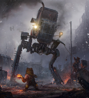
Battle for Endor
Chances are you're familiar with the Star Wars movies and characters like most humans on earth. In this image, Vasnev re-imagines George Lucas' Ewoks with an interesting fan-art like this.

Mmm. . . now it's all coming back.

And so if we remember, Ewoks hail from the moon of Endor, thus the battle you see hear.

When I saw this image I was struck at once with several questions and curious about the idea behind Vasnev's concept art.

As it turns out this was an art challenge of sorts, of which I don't know its outcome.

Star Wars


So all that aside, let's get in our time machines and travel back to the year 1983 and the movie, Return of the Jedi.

Many of you had not been born yet. But I'm sure you recall the Jedi movie as part of the Star Wars franchise and all the films that followed it. How many action figures do you own?

If you recall, those furry little bears, the Ewoks helped destroy the imperial shield generator in their forests and defeated the stormtroopers and scout walkers of the Empire. Nobody saw that coming.

Battle of Endor


Long story, short. 

I contacted Sergey Vasnev and asked if I could use this amazing image and he was gracious and generous enough to grant me the use of Battle For Endor, as a cover for the Remnants board game. (Thank you, Thank you, Thank you, Sergey.)

As it turns out if you visit Sergey Vasnev's website on ArtStation, most of his artwork lends itself perfectly to this sort of game. He's quite prolific and all the artwork is stunning. You must see it. So the idea is to incorporate more of his designs into the game (box, playing cards, etc.) so gamers have a choice of whichever design they like most. Collectors can collect all three boxes, for example.

That's the plan for now and I haven't run it by Sergey yet but, you get the idea. I hope he'll be on board and I think he'll agree so we'll see. Let me know what you think in the comments and what your favorite Sergey Vasnev work of art is. It'll be difficult to choose, I promise.

You'll notice the new game board with the city of Manhattan and new playing cards. I'm loving it so far. Overall I do like this current iteration of the game and I think it's a good place to be as I further develop the game.

At this point, I'd like to feature the game on Kickstarter.com but not sure if it will be ready for this coming April. That's what I'm trying to finish as we speak. Actually, I just might be able to pull that off because the new concept flows much better than anything I had tried before so hopefully, I'll be able to launch the game this coming year.

How exciting will that be?

I can hardly wait. 

Don't forget to sign up for updates (upper right column) about the game plus interesting reveals about Vasnev's art in upcoming posts.

Hey, check out the animation on the blog where you see the whole box in 3D and much more fun stuff.


Saturday, December 11, 2021

New Tabletop Post-Apocalyptic Game (Remnants: Supreme Survivor)

Click to Enlarge. Get eMail Updates!

Wednesday, November 24, 2021

Kickstarter Made Easy (New Tabletop Family Board Games)

Kickstarter

Kickstarter Campaign The Easy Way

How To Successfully kick off your Kickstarter 

How daunting is it to build a successful Kickstarter campaign?

The essentials are not rocket science at all. You'll need a long list of potential buyers and a great product to offer those buyers.

That's it in a nutshell. It's getting those potential buyers all lined up and primed to back, or buy before you launch. That's the tricky part.

Kickstarter Leapfrog

Easy Pre-Launch Strategy
Not everyone is familiar with crowdfunding, let alone Kickstarter. So, first things, first. You'll need a primed audience on Kickstarter who understands the platform and is used to backing and funding campaigns. 

So how do you get that primed Kickstarter audience all lined up to buy your product? Easy, just get Kickstarter to feature your product and that will improve your chances of attracting a strong audience of potential buyers. 

No promises, but it's a headstart to kickstart your next crowdfunding campaign.

Read all about it on the Kickstarter Blog for in-depth information.


Saturday, November 13, 2021

3 Essential Design Elements (Board Game Packaging Box)


Remnants-Supreme Survivor
New Remnants Box

Hungry For The New Board Game Box?

Here are the 3 essential ingredients.

Hooks, Hooks, and more Hooks.

If you're a subscriber to this blog, you probably already know about the importance of hooks. And it's worth repeating because, without the proper hooks, your audience will dismiss your game and look for another image or a catchy phrase in another game that piques their interest and excites them.

In other words, your packaging must instantly push all the right buttons for the genre. It's just that simple and that important.

Let's break it down

First things first. Your main image must grab their eye and mind all at once. For Remnants, Andrea's face, her expression, says it all. She's not startled or surprised by what she sees, but something has caught her attention.

Next, you'll notice the big-ass Glock in her bionic hand. After all, she is an Android, with a backstory, mind you. And that says a lot about her already. She knows how to protect herself. So far, so good. And who doesn't carry a weapon these days? Many people do and whether they carry one lawfully or not is another matter. But in the near future, personal protection is a must. And all the doomsday preppers said, AMEN.

Aside from all that, she's dressed to survive. Not to mention her one blue eye. That detail is mentioned in the first book, Edge of The Apocalypse (featured on the bottom right side of the box).

Other Hooks

As far as the background goes, there are subtle messages that inform the audience. In this case, the New York City skyline is rushing by and there's a massive planet looming on the horizon. (Another Earth?) Plus, you'll notice the flash of sunlight on the left. That's not part of the original image but I included it to evoke a sense of hope or normalcy. Yes, the world is a blur, but the sun still shines. That's the metaphor, in a nutshell, folks.

Okay, so much for the imagery. What about the all-important copy? Well, that's another beast altogether but let's get into it.

Tagline "Take Her To The Edge."
Tagline Closeup

Taglines

We all know about hierarchy when it comes to copywriting for advertising or packaging of any kind and as you can see, the 2 lines read:

  1. Welcome to the edge of the apocalypse and beyond.
  2. "Take her to the edge."

I hadn't come up with this until now because that's just the way things go sometimes but I think this is good enough to stick with for the next printing.

As a side note, these two lines are at the top of the box (first lines) but they're not what the viewer sees first because the name or title of the game is front and center in a much larger size, as it should be. Nevertheless, the hierarchy still works as-is and potential buyers most likely will read those first two lines after viewing the name, Remnants right in the middle of the box, and the all-important subtitle, Supreme Survivor.

The word Remnants has a built-in curiosity and that's an advantage right there. Then there's the sub-title, which has a good ring to it because it evokes the object of the game in a catchy way. Yes, I could have used lone survivor or last survivor, but the word supreme is fresh and on point for the genre.

What's effective about that first line is that it mentions the title of the first book and evokes the title of the last book. That's clever enough and a great choice of first words.

The second line is of course a double entendre. No explanation is needed but suffice to say, it's a good and effective line for those two reasons. It ties in with the first line and evokes not just a sexual innuendo, but two books in the process.

Copywriters are fond of double, or multiple meanings and I'm no different because you get your money's worth when good copy does the heavy lifting. So remember that when you write your copy next time.

Here's a good example of multiple meanings in the media today:

"Pizza lovers get it."

Funny Ad
Dogs get it too!


Short and sweet as Marco's Pizza declares in their new ad. But that didn't stop Papa John's from using the same, exact tagline. Who's line is it, anyway? (See what I did there. Right. Let's move along.)

The last line, or bottom line, as it were, evokes the subgenre and the author's name, which right now is not as important because no one has ever heard of A. R. Arias. (Hopefully, that will change next year.)

A Cyberpunk Strategy Game by A. R. Arias

So this line mentions the genre, the game mechanics, and its author. All very important elements that help sell the game in short order.

So there you have it, folks. We've dissected the front of the box and made sense of it all for aspiring copywriters and we've added strong sales copy that should help towards the long and winding road or sales funnel that hones in on prospects of the genre and beyond.

It's a win-win-win for all.

In my next post, I'll cover all the juicy details on the back of the box (so many). Now that's a can of delicious and tempting lines that should make your mouth water for more.

Bon appetite!

All comments or questions are welcome so please post them below.

See you soon. Be safe and play on!


Wednesday, November 10, 2021

10 Best Upcoming Kickstarter Board Games For 2022

 Let's dive right into this amazing list of the 10 best games that will hit Kickstarter next year in 2022.

Etherfields Board Game by Awaken Realms


Bedeville Carnival
Bedeville Carnival

Bloodstone
Bloodstone

Bruxelles 1893
Bluxelles

Cyberpunk 2077
Cyberpunk 2077

Monster Apocalypse
Monster Apocalypse

Silver Coin - Age of Monster Hunters
Silver Coin

Enchanters Darkland
Enchanters

Interstellar
Interstellar

Omega Virus
Omega Virus


Remnants Supreme Survivor

Let me know in the comments if you're getting any of these board games or plan to back them on Kickstarter in 2022.

I want to add a few more games so I'll post another list here very soon. Stay tuned for more exciting new board games coming in 2022!

Check them all out here:


Monday, October 25, 2021

CYBERPUNK Board Game Box Packaging - It's All About Hooks


REMNANTS BOX BOTTOM
Remnants Box Bottom

Okay folks, here's the back of the new box, as promised. Lots to unpack here so let's get into it.

The most important thing is the copy on the left column. Similar to the back of a book, this is all about sales copy that takes you right to the sales page on the manufacturer's website, for example.

That actual link has yet to be determined because the game is unfinished and not for sale yet, but, you get the idea. I tried my best in this limited space to cover all the important points that make this game unique and sales-worthy.

Let's face it, I'd need to write an entire book about this to be thorough but I'll have to keep it short here. As you can see, I've packed the back of this box with lots of good stuff. All that good stuff translates into many different hooks that should lead prospects to the buy button. That's the short of it and that's the result you're after, obviously. 

HOOKS

I've also stuffed 2 promos for the books on the bottom right. These are important because upselling, so to speak is part of the deal. I've included a promo for the first book in the series plus a peek at the collectible hardcover. 

What makes the hardcover collectible? Its unique design plus the fact that it includes all three stories in one book and also includes awesome photos. In a perfect world, the title should be blind-embossed or have some sort of metallic embellishing, etc. But for now, this jacket is good enough as is.

The characters up top are also hooks because they are what make the story meaningful and exciting. An example for an odd video link follows (another hook).

That's followed by a short summary of the game in the gray box. This is a crucial hook and the equivalent of a strong headline and sub-headline.

HOOKS

That's followed by another hook stating the theme of the game that provides a visual tone and what players can expect with this extraordinary game. Take a read and see if it works for you.

On the right column, you see the game board and below it, many of the components and card decks included in the game. These are all additional hooks that intrigue players.

The bottom line is simple. The back of your box must entice, inspire, and motivate prospects, your audience to find out more about the game and eventually buy it. The goal is for curious gamers to get into the theme and imagine themselves playing the game and having a great time.

AND MORE HOOKS

You want to create a burning desire in your audience that leads to a sale, hopefully, now rather than later. That's why you need more than one hook. You need as many hooks as you can configure and fit into a small space without over-crowding the box. Not an easy task, but it's always possible with a bit of planning.

Let me know what you think in the comments. I've also finished a short promo video that I'll post here soon. It's just a teaser so it doesn't include gameplay instructions. But instead, it's designed to intrigue gamers so they can find out more details about the game on the blog. Your blog should be the equivalent of a long and never-ending advertisement, but without looking or sounding like one. 

Welcome to the world of marketing, my friends.


Sunday, October 10, 2021

Cyberpunk Board Games, Video Games, and its Pop Culture Roots


What exactly is Cyberpunk? 

Here's a short video that attempts to answer that question. And what about its purpose as far as my board game, Remnants, where does Cyberpunk fit into Edge of the Apocalypse?

From my point of view, Edge explores the beginning or even a prelude to these genres and leads into a more established viewpoint about Cyberpunk culture.

That's a lot to unpack right now so I'll leave that for another post as I unveil behind-the-scenes snippets about the origins of my game and the 3 books it has spawned.

Meanwhile, take a look at this interesting video and you might want to check out Altered Carbon on Netflix for another take on the Cyberpunk genre.

Tuesday, October 5, 2021

Remnants of The Apocalypse - The All New Cyberpunk Board Game

Edge of The Apocalypse Box
New Box Bottom


Here's the bottom, or back of the new box. As you can see, I've divided it into halves, or two columns because it's easier to read that way. And it's packed to the gills with a lot of good stuff.

The goal of this copy is to intrigue players with the theme and highlight several unique features of the game. In this case, I've included the words Cyberpunk and epic, and I've mentioned the video links, which are exclusive to this game. That shows potential buyers that this game is unique and unlike many new games, they can look forward to something truly new and different.

Walking A Fine Line

There's a fine line one has to straddle when it comes to originality. Sure, you want your game to have new and unique features but you must also include familiar features and game mechanisms so players won't feel so isolated and lost from the start.

In Remnant's case, I've chosen to start the game with character placement. That way the game opens with a familiar mechanism that most players of worker placement games already know. From there, more options allow players to choose their best strategy and paths they might take to win the game.

Game Overview and Cyberpunk Themes

You'll also notice that above the main text I've added a short summary of the game (gray box) including the features that make it unique. That helps players imagine how the game plays and its overall tone. In essence, this short paragraph must hook the player at first read. Keywords are important so I've included the word Cyberpunk to reflect the theme and tone of the game. Plus, the character images above also serve as a hook. One of the main characters is Pucho, a notorious hacker of his time.

Story Hooks - How Many do you Need?

In fact, that short paragraph in the gray box includes no less than five hooks. Count them and see why this is so important in attracting and intriguing players right away. Let's face it, there's not a lot of room on the box for long-winded text. You must highlight your game's unique features and what it has to offer from the top in very short order.

As you read the remaining copy (about 6 short paragraphs) you'll need to include even more hooks throughout so make sure to highlight all the exciting and engaging stuff your game is made of. Remember, you only get one brief chance to make a great impression so make it count.

When writing copy, always keep in mind the main theme of your game and its unique features, and work all that into your writing. In this case, I've mentioned Cyberpunk and also worked in the CTA or call to action with two lines:

The Moment is Here, The Time is Now.

About Themes

As far as themes go it's worth mentioning the difference between the main theme and minor themes in your story. In Remnant's case, the main theme is survival during the apocalypse but the overall tone and backdrop are Cyberpunk. That means, digital events, including but not limited to hacking, digital tech, screen displays, advertising references, holograms, and more. Something along the lines of Blade Runner 2049, which has been an inspiration for this game and its three books.

To Buy or Not to Buy

Asking potential buyers to buy your game can be stated in many ways. I tend to never use the word "buy" because it has a connotation of loss built into it, as in spending. Although, if you use the word buy it's okay, I suppose as long as buyers feel that they're getting their money's worth.

Otherwise, I do prefer to include a soft CTA, as I've done in the text for this new box.

Sidebar:
I've also included a promo for the first book in the series, Edge of The Apocalypse on the lower right. The paperback is available on Amazon but players can download a free PDF copy on The Game Crafter Downloads website.

For my next post, I'll feature the new collectible hardcover novel that will be out next year to accompany the new game. It has a new cover! By the way, the difference between the hardcover novel and the three paperback books is subtle but somewhat obvious. For example, the novel features the three short stories integrated as one continuous story as opposed to the three books, which each have their own ending. Also, the full-length novel includes several chapters, e.g., The Notorious P.I.G., aka, Pucho Is Great, not featured in the short books. More about this in an upcoming post.

Please leave your comments and questions below and I'll be back with much more about Remnants and its progress along the way.

Until then, play on, folks!

Thursday, September 2, 2021

Board Games - How to Properly Name Yours

Remnants Board Game
New Prototype Box -Remnants

Well, here I've thrown a monkey wrench deep into the development of the new game. Nothing disrupts the flow of work like changing the main title or name of a game. Obviously, I'll have to change everything.

Hmm, what to do? Let's unpack this thing. 

Okay, let's face it, I've never been crazy about the name Millennium because it's such a common and overused word. But, that's the name that came to me out of the blue so I embraced it for lack of having a better choice at the time (a working title). Although, I'll admit it sounds futuristic and all-encompassing. Yes, good traits but too general in scope.

Now, enter a video game by the name, Descenders, and suddenly a light bulb moment. Why am I using Millennium, which only describes a length of time as opposed to what the game is about or what its characters do? Millennium is just a period of a thousand years. In this case the new millennium, the year 2000 and beyond. And yes, that simple detail is built into the story but it doesn't say anything specific about the game, its protagonist, or its characters.

The name Descenders, describes what the game is about because it's an extreme downhill mountain bike race. That works nicely but more importantly, it creates a hook within the title. 


The name Millennium offers no details about the new millennium. Other than the tagline, Glory Beyond The Ages. That's a good hook but it's not specific enough. 

The new name, Remnants is more specific because it describes how the characters are defined and what they are known as. That's a stronger hook all by itself with just one word. 

And so it's easy to see why I'll have to change the name from Millennium to Remnants. The word remnants has a built-in curiosity that provokes questions and that's priceless. I also considered using Defenders, but again, that's a very overused word in gaming. 

An alternate word for defenders is Defensores, in Latin. I like how Defensores sounds and how it looks but even in Latin, it seems a bit trite. Luckily these are just prototypes and changes of any kind go.

So there you have it. A quick lesson on how to best name your game for greater impact. Try to choose a word that describes the main concept or theme for a catchy hook that resonates in more ways than one.

Are you having trouble with the name of your game? Does it lack that catchy hook? Let me know in the comments and I'll post it here to see if the gaming community at large can find a better solution. 

Come on, be brave. It's all in good fun and a great way to tease out the best name for your board game or card game and it won't cost you a dime.

Play on gamers!

For my next post, I'll feature the back of the box with the revised copy for the new Remnants name. It's still in flux but I think it's much better already than what I originally had. This is almost as important as the cover, if not more because in effect it is sales copy in the guise of game information.

Check it out soon. You can sign up for private email updates in, upper right column.


Sunday, August 22, 2021

New Post-Apocalyptic Board Game and Books for 2022

New Collectible Hardcover Novel


Here's a sample for the new hardcover novel, Edge of The Apocalypse 2058. The three short stories are available on Amazon separately but this full-featured novel with illustrations will be available only on B&N. That's Barnes and Noble, of course, and it will be a hardcover with dust jacket edition. For now, I've opted for this cover, which I think works well. As much as I like the paperback edition of the short story, with the backdrop of New York City blowing by, this cover really works for this edition. What I really like about this cover is that it recalls the game box so that's a better fit.

It's one of those things where I want to keep using a familiar image although, that's not typically how it's done. So before I finish the board game, which should be by the end of this year around December, I might have another image for this hardcover edition, but most likely I'll stick with this one.

I'll be posting more about this new novel, including the back cover, flaps, and publication date.

There are many options but I can only use one proper image and so that's where all the indecision comes in or maybe using an image that's too busy is often an easy mistake to make. It's a lot like when I couldn't find a proper cover for the game and I went through so many designs that I wasn't crazy about until I found the one closeup image of Andrea that worked nicely. And even though I did alter the image slightly, it was by far a better option than all the other covers I had tried.

Again, I'll give credit to Mystic Art Design on Pixabay.com for such a fine image:

Pixabay Image

So in a way, I got lucky and hadn't printed another prototype that I really didn't like. As you can see below, I changed the background to fit with the story and added a Glock in her right hand. I also made one of her eyes blue to make her even more interesting. I mention that detail about her eyes in the early chapters of the book.


Current Millennium Prototype Box

Right now, as far as the board game goes, I'm tweaking the new board and adding several cards to match the board as far as Actions go. The board is all but done and I'm working out the new designs for the playing cards. I've given myself plenty of time to get all that done so I should be finished by December.

That means that I'm also trying to finish a short promo video to go along with everything and I hope to have everything done early next year. If that works out I'll be looking to score several good reviews and finally release this game on September 11, 2022. If I keep working at my current pace, I should be able to get there.

I'm also learning all the nuances of Instagram, and there are plenty, so I can build an engaged audience by next year before September. 

I've got so many other things going on that I have to get this done once and for all. It's high time after 4 years of development and in a perfect world I would've been finished a year ago but I am working all by myself and don't have a huge team behind this game. But maybe that's a good thing.

Let me know what you think about this new cover in the comments below and if you want updates on the game and books, sign up for email updates up top on the right. I only use your email to send you updates maybe once a month so no worries because your privacy is secure.

Until then, folks, play on!


Wednesday, August 4, 2021

Board Game News - A Must Watch!

Saturday, July 31, 2021

New Board Games - A Millennium Update [ The Apocalypse is Alive and Well ]

new game board for millennium
New Game board


Hey folks, I just wanted to post the latest update for Millennium. I'm still using the six-fold game board but I've added wide borders to accommodate playing cards. As you can see, I've also added several graphics keeping the theme in mind, of course.

I think this works and even though the map is a bit smaller, I think it will still be legible enough to play without straining your eyes to read. I've slowed down my pace and still working on the new role-playing card deck but I plan to get back into that this coming week and hopefully finish it before this coming month is gone.

The main difference here is that I'm replacing the states with territories. Based on current demographics and other criteria, race and ethnicity dominance will be a major factor after an apocalypse and so I'm working all that out as we speak.

How Time Flies

We're quickly heading into September and that's when I wanted to launch this game but I insist on not rushing the process because that will only result in putting out an inferior version. Every time I turn around I find ways to improve the graphics and overall design so all these delays are for the good of the final product.

I'd regret launching this game only to realize that I've figured out a better design via game mechanics or graphics so I'll be working long hours by the end of this year to print another prototype early next year in 2022.

That's just the way it is and so no worries because the game keeps getting better, although that's not to say that I'm striving for perfection either. I realize that small changes can be made along the way after I launch next year. My main concern is to produce a playable version with minimal corrections afterward.

Main Goal

My goal is to launch an interesting and fun game ready to hook new players in this genre with something different but familiar that has a strong storyline. New games simply cannot afford to launch with bad or tepid reviews. 

And so it takes time to develop a great game that hooks and engages players in the genre and beyond. I'm also working by myself for the most part except for the help of my teenage kids that said the rulebook was not clear enough. I don't doubt that because I'm trying to keep the rules to a minimum but I can't leave anything out. I've since revisited the booklet and made several changes to clarify the rules and gameplay.

Play Testing

At this point, I won't ask them to play the game until I reprint the next prototype because I've made quite a few changes and corrections to the rulebook, the board, and the box. Right. It's an entirely new look and feel and the best changes going forward.

Thanks for your comments and questions. I'll be back soon as I get more work done. 

Until then, stay safe and play on, people.

BTW, soon you'll be able to download the new Rule Booklet on the right column under Andrea. Believe it or not, I'm confident that I can really finish the game by the end of this year. At that point, early next year, I'll be posting Youtube videos about the game and sending out free game boxes in exchange for reviews before the game officially launches on September 11, 2022.


Friday, June 18, 2021

Who's Who? Amazing New Characters in Millennium Board Game


Here's a cyberpunk image I found on Canstockphoto.com for one of Millennium's role card decks. 

I'm calling him, Pucho (pooch-o) and he brings some much-needed levity to the game. I'll simply add a sly smile with Photoshop and set him free inside the game.

I've added some "funny" dialog between him and Andrea when they meet in the novel edition of the three books. Otherwise, you can also read the short introduction in Edge of The Apocalypse, Andrea's Journal.

For aspiring writers, check out how I presented this character by not using gratuitous humor as you might expect from a Joker. Humor comes later in the story. When you read the passage, this mugshot will make total sense.

Actually, I did hit the jackpot by finding CanStockPhoto.com because they have a great selection of apocalyptic and cyberpunk scenes. The only drawback is when the model's mug for the camera. I can hardly use any images when you pose or stare into the camera unless your character is trying to make a statement about their demeanor or connect with the player in some odd way.

On the left is another main character, Freedom, also from CanStockPhoto. This is an original shot that I've modified for the playing card where she has a weapon (for self-defense). 

BTW, several of my posts are out of order because this was a previous draft I'm finishing now but you can see the finished playing cards for these 2 characters in the post below.

I just wanted to include this short article so you can see the difference between the original photos and the final playing cards. As you can see, in a post-apocalyptic world, these characters fit in perfectly, and as I've said before, I'm going for a certain look and feel for this game so it's evolving nicely so far.

My next hurdle is to design interesting mechanics to give these characters meaningful actions that bring players closer to winning the game. That's easier said than done but it's not rocket science, so I should be able to figure it out soon enough.

Yes, it's an unusual way to design a game but for me, it makes sense because I'm starting with the end product in mind and working my way backward until I find the perfect blend of imagery and gameplay that's fun and interesting. 

I'm not your typical board game fanatic and that can be either an advantage or disadvantage but I know enough about playing board games to design the kind of game I can't find but I'd like to play. And so that's where Millennium comes in. This is the kind of game that's different yet familiar enough to attract players in this genre.

And speaking of genres, apocalyptic and post-apocalyptic board games are not usually runaway best-sellers by any means but there's still an active audience that enjoys playing these kinds of games. Besides, Millennium is a different kind of post-apocalyptic game with a focus on positive outcomes, as opposed to the doom and gloom of other games in this genre.

That's a fine line to walk but I don't mind taking chances especially when so many of those dark-themed games are so played out. Not to mention this game is female-centric so it's a different POV angle altogether.

Everything remains to be seen. It's a roll of the dice as everything in life is so we'll see if I can get to the finish line by next year and finally put the game out there. Either way, it's an accomplishment and a stepping stone to other games and stories that are worth telling.

As the old saying goes, "no risk, no reward." 

I'll see you back here soon. 

Say it in the comments, please.


Friday, May 21, 2021

MAXIMUM APOCALYPSE- A REVIEW PLUS UPDATES ON THE NEW MILLENNIUM BOARD GAME


I haven't played this game but it looks interesting with so many options and I like the comic book graphic style artwork. Although, it's fantasy-based and for younger audiences. Nothing wrong with that if you're into that sub-genre and circling that age range. Let me know if you've played this game or plan to get it and if you like it. 

The New Millennium Update

Below is the latest update for Millennium with its 4 new characters. As you can see Millennium is for older audiences, at least 18 and up with realistic settings and stories. First up is our cover girl, Andrea. Make no mistake, aside from her soft facial features and childlike freckles, she's one tough cookie.

And don't let Alex fool you either. He might remind you of an underwear model (ouch) but he's strictly business. Freedom has a quiet charm about her but she's the real deal too. Don't piss her off because she'll unleash her super freaky side in a heartbeat.

And Pucho . . . well he's another story altogether. My alter-ego without a doubt. This guy is slick and even hilarious when he wants to be. But overall he's an introvert with a sick twist. Take him for a spin and find out what makes him tick.


Here's a sneak peek at one of the new pages from the Millennium rules booklet. As you can see, I've updated all the characters to include, Pucho, a joker of sorts who's sure to add some levity to the game, plus I've added a different, much cooler version of Freedom to this mix of oddball characters.

The best thing about this new batch of characters is that their appearance is much edgier and cooler than the original versions. Below is a comp of Freedom's new look. 

Thank you to CanStockPhoto.com for these awesome images.

These new photos will appear in the new Millennium card deck with the next printing in July. As you can tell by her looks, when Freedom speaks, everyone listens. She's far beyond just being a hot chick, she's got important things on her mind and plenty to say, so listen up. 

As for Pucho, well he's not easy to figure out. One minute he's quoting Malcolm X, the next he's spewing nasty stuff like, "Dangle that thought, I've gotta drop a deuce," or "... lay down some fudge." Right, right, he's got those kinds of issues. It's all in good fun and besides, girls like Freedom and Andrea love that kind of stuff.

As far as Andrea's best friend, Maria, well so far she's only featured in the books but as time goes on I might add her to the card deck and the board game.

A lot of things remain up in the air but as Covid-19 diminishes in our rear-view, this game gets closer to publication.

As I see it, once we get back to the way things were before COVID-19, it's going to be an outdoor fest for some time and few people will be playing board games. So with that outlook in mind, I'll still launch the game in September but I'm not expecting any real activity for several months.

The biggest lesson I've learned throughout this process is that taking my time is better for the quality of the game. The beginning of the design process is usually tentative at best and so as time goes on, ideas come into focus, and weak concepts become stronger.

I have to say that Millennium has evolved in ways I had not expected and as the following months blur across the COVID-19 landscape, this board game will emerge as a different kind of post-apocalyptic game that acknowledges our current life and times while giving a refreshing nod to America's nostalgic past.

It's an exciting time in more ways than one and I hope you can join me along the way as Millennium makes its long-awaited debut in September.

Say it in the comments below, thank you.

Tuesday, March 30, 2021

Hell Gate City Companion Preview

Tuesday, March 2, 2021

Millennium Board Game - A Nod to Cyberpunk 2077


Cyberpunk Prototype Box Design

Here's the latest update on the next prototype box. As you can see, Andrea, true to form, has robotic titanium-reinforced arms below her elbow. You can read more about that in the ebook, Edge of The Apocalypse available on Amazon.com.

So, this box has been through quite an evolution. This new design is probably the most direct and focused image based on the story in the three books. Andrea's Journal, included in each box, hints at events behind the scenes in detail about how the coming apocalypse gets underway and everything that happens to Andrea and her best friend, Maria.

Printed Journal Booklet

It's a fun story despite the fact that it takes place during an apocalyptic event, but hey, even the apocalypse should be entertaining at some level. But from my point of view, or Andrea's, there's so much more to Doomsday than doom and gloom.

And so, there are quite a few light-hearted moments and funny, albeit, tense situations, like their trip northeast when they pick up a suspicious hitchhiker in Jacksonville, Florida. Yes, Florida rears its dubious head, rightfully so, and not just because I live there.

My only reservations about Andrea's new image is the goggles, which give it a bit of Cyberpunk vibe, but I think I'll get over that and probably embrace it a bit more as I go along. Check out the robitic arms in a scene from the video game, Cyberpunk 2077.

These yellow marvels are attached at the shoulders, unlike Andrea's, which start at her elbows, sort of like the one Furiosa (Charlize Theron) sports in Mad Max: Fury Road. Yes, plenty of inspiration to feed from. Not to mention Blade Runner, which in my opinion leads the way with Cyberpunk history, if you will.

And so, I'll admit that while the Millennium game and Edge books are not hardcore Cyberpunk stories, they certainly lead into Cyberpunk territory. What separates my stories is that they reveal the seeds of Cyberpunk somewhat just as the recent Capitol insurrection revealed an underbelly that until that point had only been referenced and uttered in the deepest parts of the internet and among rogue QAnon groups.

Cyberpunk 2077 Game Trailer
Also, Andrea's one blue eye might suggest some sort of 3D camera lens capability but she was just born with a rare condition known as, heterchromia iridum, or different colored eyes, among several other odd birth defects mentioned in the books.

To really appreciate the board game, you should read the books because they give all the important backstory and juicy details that the game leaves out. And those ommissions are not intentional but they certainly are necessary because each product has its own vibe as far as feasability to inform.

And so, the books round out the game and vice-versa. It's a win-win all around.

In my next post, I'll talk about several other characters, which are still under development; namely Alex, Freedom, and Adam. These names are subject to change, maybe to a more descriptive image and so that remains to be seen.

Otherwise, Millennium lives on as a very ambitious board game with a scope unlike most others. I only wish I was further along with it but at this point I don't want to rush it out to market because in all reality, it's just not quite ready for prime time.

Getting it ready to meet the needs and wants of savvy players is what it's all about. And so the work goes on until the game is beyond awesome.

Stay tuned. It's getting close.

*** Remember to sign up here for private email updates about the Millennium Board Game. I hope to release the first edition this September 11, 2021. ***

Say it below in the comments.

Your Name on the Next Mars Rover Mission!

 Want to send your name on the next mission to Mars aboard a Rover? 

Read all about it here: Your Name on Mars!


Here's what a boarding pass looks like. 

Friday, February 26, 2021

Post-Apocalyptic Steampunk in the New Millennium


New Millennium Box

And the winner is . . . ?

Heck if I know. I've been through dozens of designs and not really crazy about any of them. This comes as close to what could make it into the final design.

It does have a Steampunk or Cyberpunk vibe to it, which is not what I'm going for but, I'll run with this amazing image because it's very close to what I want for this box cover.

This is a free Pixabay image and the only two things I did were change one eye to blue and desaturate the overall color. I love it so far and I hope to print the next prototype with this design.

If you're familiar with this game's backstory, (Edge of The Apocalypse) its protagonist is Andrea Estrella, who originally had platinum hair. I might change her to this image, for now, otherwise, I can give this cool chick a haircut and hair color change.

Guest what? It's much easier to leave her as is and make new playing cards for Andrea. Stay tuned for that in the coming days. I might add a gun to her.

Let me know what you think in the comments. I might print the new prototype in March or April if I can pin down a few more game mechanics. It's all finally coming together and it's about time so onward it is gamers.

Play on.


Saturday, February 20, 2021

Hello gamers, it's about time to update my posts. I've been busy updating Millennium before the next printing of its 3rd prototype. It's a slow and tedious process, especially in my case but I hope to send for another prototype soon, maybe in April.

Here's the newly updated box cover I hope to print with the spot-gloss option.

Millennium Game Box
New Millennium Game Box
This is a rough version of the new square box. (large stout box) The main difference is the gradient around the letter M, which will be printed in shiny spot-gloss while the remaining image is a matte black around it.

Here's a sample of spot-gloss on the game board. It gives the spot a glossy and raised texture that's hard to see here but it is a very impressive effect.

I decided to go with a more comic book style to the box and a graphic novel feel for the books with the same idea. More contrasting colors and black and white gradients throughout.

It's not a hard and typical graphic novel look, but it has that flavor. As the design progresses over the next few months, I suspect I might indulge a bit more in the graphic novel approach to all the artwork.

Spot-Gloss
Overall, I think it's a bit more eye-catching and trendy, I suppose so this could be the direction I'll go in when I launch the game this September (fingers crossed).

It's a work in progress, as all things are and so I hope to fine-tune everything else to match and optimize the game mechanics, which is very important. I tend to work backward and tackle the design elements first because I work visually towards the end product. So all the moving parts are in place but I need to synchronize all those wonderful parts with an exciting game that players will love.

That's really the hard part. Everything else is window dressing but for me, that's an easier way to develop games. It's a lot like designing the poster for a movie before you write one word of the script. I think it's a good approach in this case too because I work visually, which is a good thing since players are first going to see the box before they learn to play the game.

I don't know about you, but that makes perfect sense to me.

In reality, I work on everything along the way, including writing descriptions of the game and developing images to go along with it for marketing and promotional purposes. And that reminds me of the back or bottom of the box. I won't be printing the bottom now but here's a preview of the "finished" design.

I've enlarged it so you can read the text, see the texture, and get a feel for the game and how it's played. It's an ambitious project with a broad scope so that takes time to develop and refine as I go along. Ideas are simple but their execution can be daunting as you can see. This image has not been updated with the new gradients yet but it's just a snapshot of the actual prototype box.

Back of Millennium Game Box


After I'm done with the game I'll post more about how I went about this design and why. There's much more than meets the eye here because there's so much to tell in a very small space. And so that's always a challenge. 

There's an entire book worth of information here as far as design and development but that will be for another post and another time.

Right now, I'm stuck in development hell as long as COVID-19 is around. But that makes the game even better because I'm not rushing anything.

Stay tuned for much more to come about the game's progress. It's slowly but surely getting to a better place than when I started so improvements are essential.

Meanwhile, keep on staying alive and well and keep playing this wonderful game we know as, life in the fast lane.