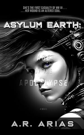
Book Giveaway - Asylum Earth: Age of the Apocalypse

Goodreads Book Giveaway

Asylum Earth by A. R. Arias

Asylum Earth

by A. R. Arias

Giveaway ends May 17, 2026.

See the giveaway details at Goodreads.

Enter Giveaway
Showing posts with label apocalyptic. Show all posts

Thursday, January 1, 2026

Asylum Earth-- Aftermath: Manhattan Protocol


Asylum Earth's New Look

It's collaboration at its finest. When AI meets my imagination, anything goes, as you can see here. Yes, it's been a while since I posted any updates about my board game, Asylum Earth. Mainly, I haven't had the chance to make any progress with it until I had this brilliant idea. After mulling it over for some time, I finally decided to bring in AI to give me a helping hand, and the rest is history.

That's not to say there are no more challenges because AI produces challenges of its own as it develops your new vision, so in a way, AI is a double-edged sword, but in a good way. In this case, AI has helped me see a finish line that has evaded me for quite some time. 

Here's the new game board as proposed by AI. After some tweaking, it's manageable, and I like its aesthetics and everything that goes with it, e.g., Event Cards, tokens, game play, and so on. So I'm slowly chipping away at these new ideas and integrating them with all my artwork. So far, I've finished the box, top, and bottom, which have mostly stayed the same for the exception of a new sub-title.

So the main difference is the Event Cards and some of the tokens; otherwise, the original game and its characters remain the same. In fact, AI has integrated my artwork nicely. 


Saturday, June 18, 2022

Melancholia By Lars von Trier - An Epic End of Days Classic Film


SPOILER ALERT *** ENDING TO MOVIE

This is The End

Don't you love it when the end of the world is so . . . spectacular?

I can't praise this film enough. It's an absolute classic masterpiece in every way. From the enigmatic musical score (Richard Wagner's Tristan und Isolde) to its devastating ending sequence, Melancholia is . . . well, divine. 

And let's just say that sad endings have their place in cinematic history.

The point of von Trier's film is that this doomsday scenario is what he feels about the future of the earth and who's to say that it's not accurate? It's anyone's guess, I suppose but let's keep in mind that fiction, great fiction is always rooted in a grain of truth.

Yes, in this case, that means biblical truth, for those inclined to believe in the KJV Bible, that is. And yes, there are many Catholics who do believe, as there are many agnostics on the fence about such matters. But the facts remain clear for all to witness and research in the King James Version of the bible, since 1611. 

Dispute these facts at your own peril or to your satisfaction. Either way, von Trier's artistic interpretation of the apocalypse as depicted in the book of Revelation, is personal and quite effective.

Asylum Earth -The Covenant

In walks Asylum Earth with a similar ending except that our beloved earth is smitten, or showered with blessings from heaven and it is not obliterated. Instead, the earth survives a revival of sorts as our galaxy performs its last dance with a little help from Saturn and our planet renews its vows with the cosmos . . . sparkling in its wake.

Of course, I'm not comparing my board game to von Trier's cinematic masterpiece. The main distinction is that the outcome of the game (or novel) is a positive one. This for me is rare because most, if not all my stories end in a Melancholia way. I'd already mentioned in a previous post that I chose to go in a different direction only because of the gloomy atmosphere (global warming) the earth already faces.

Overkill, literally will not work.


And so, to be clear, the title, Asylum Earth-The Covenant is a nod to one of God's previous covenants with humankind, which is to never destroy the earth with a flood again; thereby using a rainbow as a sign.

So God said to Noah, "This is the sign of the covenant I have established between me and all life on the earth."

For what it's worth, I think the novel and board game are timely messages with plots and themes which are quite apropos to the times. As far as I'm concerned, a little hope goes a long way these days so no regrets about the work I've already done and no plans to change it.

Your Takeaway

That's one thing about stories; they should conform to the times so that they fit in the grand scheme of things about to befall us either as individuals or as a species. There's no advantage to writing against the grain to prove or make a point to stroke your ego as a contrarian. It is far better to tell the people what they subconsciously want to hear because there is infinite wisdom in that consensus.

And so with that, I'll quit while I'm ahead; at least in my own mind. 

Tell me in the comments what you thought of the film, Melancholia and what your favorite doomsday movie is.

Remember to subscribe to the Asylum Earth Newsletter for updates about the upcoming game and novel: Asylum Earth - The Covenant. Also, you can get important updates and discounts for the game by clicking on the game box.

Riddle: Who's part human, part Cyborg, and carries a gun?

Find out in my next post.


Tuesday, March 15, 2022

Tabletop Apocalyptic Board Games (Remnants Supreme Survivor)


Remnants New Game Board

Here's an update for the new board. It's been a heck of an evolution for this game. This new board is actually a map featured in the first prototype. The USA map proved difficult to manage and that was apparent from the start but ambition can be not only daunting but sometimes a roadblock.

So now I'm back here and the game seems to flow much better with this new board. I never was a big fan of the full USA map because it looked trite and ordinary. With this new Manhattan city map, the game is more focused and familiar to me and far more interesting.

I've added another snarky card deck of explosions that include time clock events so it's all coming together in the final destination city where the girls, Andrea and Maria flee out of Austin, as told in the novel, Age of the Apocalypse, the hardcover edition.

I also started a new website to promote the three books tied to this game. So there's a lot going on and hopefully, I'll get to the end of it soon. No rush, no worries. I'd rather take my time and get it right.

As for the box cover, I've decided to print the next prototype with this image of Andrea, and subsequently, there will be more choices including boxes with Sergey Vasnev artwork.

Peace out.

Saturday, November 13, 2021

3 Essential Design Elements (Board Game Packaging Box)


Remnants-Supreme Survivor
New Remnants Box

Hungry For The New Board Game Box?

Here are the 3 essential ingredients.

Hooks, Hooks, and more Hooks.

If you're a subscriber to this blog, you probably already know about the importance of hooks. And it's worth repeating because, without the proper hooks, your audience will dismiss your game and look for another image or a catchy phrase in another game that piques their interest and excites them.

In other words, your packaging must instantly push all the right buttons for the genre. It's just that simple and that important.

Let's break it down

First things first. Your main image must grab their eye and mind all at once. For Remnants, Andrea's face, her expression, says it all. She's not startled or surprised by what she sees, but something has caught her attention.

Next, you'll notice the big-ass Glock in her bionic hand. After all, she is an Android, with a backstory, mind you. And that says a lot about her already. She knows how to protect herself. So far, so good. And who doesn't carry a weapon these days? Many people do and whether they carry one lawfully or not is another matter. But in the near future, personal protection is a must. And all the doomsday preppers said, AMEN.

Aside from all that, she's dressed to survive. Not to mention her one blue eye. That detail is mentioned in the first book, Edge of The Apocalypse (featured on the bottom right side of the box).

Other Hooks

As far as the background goes, there are subtle messages that inform the audience. In this case, the New York City skyline is rushing by and there's a massive planet looming on the horizon. (Another Earth?) Plus, you'll notice the flash of sunlight on the left. That's not part of the original image but I included it to evoke a sense of hope or normalcy. Yes, the world is a blur, but the sun still shines. That's the metaphor, in a nutshell, folks.

Okay, so much for the imagery. What about the all-important copy? Well, that's another beast altogether but let's get into it.
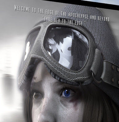
Tagline "Take Her To The Edge."
Tagline Closeup

Taglines

We all know about hierarchy when it comes to copywriting for advertising or packaging of any kind and as you can see, the 2 lines read:

  1. Welcome to the edge of the apocalypse and beyond.
  2. "Take her to the edge."

I hadn't come up with this until now because that's just the way things go sometimes but I think this is good enough to stick with for the next printing.

As a side note, these two lines are at the top of the box (first lines) but they're not what the viewer sees first because the name or title of the game is front and center in a much larger size, as it should be. Nevertheless, the hierarchy still works as-is and potential buyers most likely will read those first two lines after viewing the name, Remnants right in the middle of the box, and the all-important subtitle, Supreme Survivor.

The word Remnants has a built-in curiosity and that's an advantage right there. Then there's the sub-title, which has a good ring to it because it evokes the object of the game in a catchy way. Yes, I could have used lone survivor or last survivor, but the word supreme is fresh and on point for the genre.

What's effective about that first line is that it mentions the title of the first book and evokes the title of the last book. That's clever enough and a great choice of first words.

The second line is of course a double entendre. No explanation is needed but suffice to say, it's a good and effective line for those two reasons. It ties in with the first line and evokes not just a sexual innuendo, but two books in the process.

Copywriters are fond of double, or multiple meanings and I'm no different because you get your money's worth when good copy does the heavy lifting. So remember that when you write your copy next time.

Here's a good example of multiple meanings in the media today:

"Pizza lovers get it."

Funny Ad
Dogs get it too!


Short and sweet as Marco's Pizza declares in their new ad. But that didn't stop Papa John's from using the same, exact tagline. Who's line is it, anyway? (See what I did there. Right. Let's move along.)

The last line, or bottom line, as it were, evokes the subgenre and the author's name, which right now is not as important because no one has ever heard of A. R. Arias. (Hopefully, that will change next year.)

A Cyberpunk Strategy Game by A. R. Arias

So this line mentions the genre, the game mechanics, and its author. All very important elements that help sell the game in short order.

So there you have it, folks. We've dissected the front of the box and made sense of it all for aspiring copywriters and we've added strong sales copy that should help towards the long and winding road or sales funnel that hones in on prospects of the genre and beyond.

It's a win-win-win for all.

In my next post, I'll cover all the juicy details on the back of the box (so many). Now that's a can of delicious and tempting lines that should make your mouth water for more.

Bon appetite!

All comments or questions are welcome so please post them below.

See you soon. Be safe and play on!


Saturday, July 11, 2020

ARCHIVE: A New Sci-Fi Movie - A Rothery VOD Film


Directed by Gavin Rothery. With Rhona Mitra, Theo James, Toby Jones, Stacy Martin. 2038: George Almore is working on a true human-equivalent AI. His latest prototype is almost ready. This sensitive phase is also the riskiest. Especially as he has a goal that must be hidden at all costs: being reunited with his dead wife.


I'm watching this movie tonight so I'll post my review on Sunday. I've got my fingers crossed so I hope it's a good one. Happy watching.


Here's an update about my review of this movie:

Loved the concept and "special effects" or visuals. But unfortunately, this is one of those movies with very little tension or subtext to keep you riveted and keep you in suspense. Couldn't get into this film as much as I wanted to. Otherwise, it was interesting enough to watch until the end.


The ending for me fell short because I could hardly hear their soft-spoken voices but even when I got the words I'm not quite sure I got the ending.


I'll have to watch it again to see if this film gets any better.


SPOILER:

Okay, so after watching this movie again I can say that this film has a The Sixth Sense meets Ex Machina kind of feel. I think I loved it because it definitely had some good moments.

Friday, December 13, 2019

Epic Apocalypse - Edge of Time Book Series New Covers

Hey folks, the new year is almost upon us and I hope that all your aspirations are in place and taking place this coming 2020.

I've revised my book covers for the series once again because I needed to match them a bit better so they look like they belong together.

For now, this is what I've got and as you can see the book in the middle, Epic Apocalypse has a bit more color but what good is using fire if you can't show it burning hot?

Right, and so I've lowered the color saturation in the artwork quite a bit so it still has those dark edges and these covers seem to work for the series.

When designing your book covers for a series, keep in mind that you want your book covers to match either in colors, typography, or artwork, ideally all three should match. The middle cover is by another artist but I don't think it's off key. The other covers are my own design in Photoshop and I might still change the third book, although I do like how these three covers look together.

The main difference and what helps this trilogy is the red, white, and blue bands of color at the top. That's just a feature or "gimmick" to unify this trilogy, which gives the series a deeper meaning, plus it looks cool when you have the three books together on a shelf.

Only time will tell if this book series will be popular enough to make a bestseller list. I've really pulled out all the stops on this one and hope it will be a success. But it's hard to say at this point because I'm new in the game.

Don't underestimate yourself 
and what you know . . .

But here's the thing, don't underestimate yourself and what you know. You just might surprise yourself along the way. For me, the series will be a success in my mind because I've worked hard to get here but if the financial rewards are scarce, I'll learn from it and make adjustments to get it right next time.

Another thing is that this series doesn't necessarily have to identically match the artwork from the board game, although that wouldn't hurt, but these are standalone stories, so it's okay if the artwork is a bit different, as long as it's not too far off.

The board game does of course promote the books, and vice-versa, but each product should stand on its own, from a marketing point of view.

I've got plenty of work to catch up with so please feel free to leave any comments or questions below.

And as usual, play on!


Tuesday, December 18, 2018

Awesome Book Cover Design Tips [Apocalyptic with Photos]

 
New cover
Here are several tips to help you improve your book cover layouts. For this cover, I wanted to show the apocalypse in a different, more sophisticated way as opposed to the usual burning buildings and explosions, that are so typical of this event.

The ominous sky and its warm/cool colors are reminiscent of a lunar eclipse. The skyline is not on fire, but you can see evidence of a blast blowing across.

In the foreground, the main figures (Andrea and Apollo) stand and watch the event as if protected from the blast and superior to its effects.

The actual story starts off with a blast in Austin, Texas, but of course, New York City is the center of 9/11 and so I felt it was more important to feature that city on the cover. Besides, Andrea and Maria eventually wind up there.

This composition needs a bit of work because the main image is competing with the background (Freedom Tower) so I'll have to take more time to tweak it. Chances are that I'll have to reduce the size of the tower and that should fix the problem, but we'll see.

I also added Andrea's trusty pooch, Apollo, to the cover because they are inseparable. The main reason for adding these two images was so that the book cover resonates with the game box cover. I'm still debating if I'll match the gray colors of the box with the book. (A compromise would be desaturating the colors in the book cover.)

As it was before with only the skyline, there was no point of reference to the board game. Besides, I think this image of Andrea tells a deeper story overall. If you look closely, she's carrying a gun for protection and you can see that her hand is mechanical (as in cyborg).

Revised version

Notice the subtle but very important differences in these two covers.
Let's start at the top with the hook.

  •  I added the word and with an ellipsis so it flows better.
  • I moved my name under the title so I could unclutter the main image.
  • I also reduced the size of the background tower a bit so it doesn't compete with the main image.
  • I'll have to figure out what to do with the color band running across the bottom, now that I moved the name up. Most likely I'll remove it when I fix the artwork (missing feet). Right now I'm not sure of the trim on the bottom so that's still a bit of trial and error.
So far, I think this works and hopefully, I can keep it this way up to the date of publication unless I find another way to improve it. But as a group, the freedom tower, Andrea, and Apollo make a nice diagonal line for a much more pleasing composition. I might either blur or take down the saturation of the tower just a bit to see how that looks, but the Freedom Tower is an important part of this story and that's why I'm thinking of leaving it alone.

Current Box

So the whole point is that you should always show your main image at its best. In this case, the juxtaposition of the main image grouped with the background is symbolic of the events in this story so it's okay to visually group them as one.

You want to tie-in the main image with anything that will tell a deeper story at a glance.

The real trick for me with this unusual array of products is to prioritize the purpose of each product. My main goal is to promote the board game with the book. But at the same time, the board game should also promote the book. It's a balance of design and writing that works discreetly with subtlety, although, it's really all about the board game.

For those of you following the evolution of this game, I'll be posting updated photos of the new game board and several new card decks soon.

I'm getting really close to locking down all the elements and mechanical aspects of the game and synchronizing the artwork as a whole. The most important development to the game has been the addition of the Manifesto Card Deck, which sets off the game in a grand way.

Nothing else changes as far as skills and rescue goals. Everything remains as it was, but the Manifesto serves as an "inciting incident" (novel speak) of sorts. This was the big thing I'd been missing and finally found a way to include it and present it without too much additional cost.

Final Revision

Here's the final version (subject to change) with a pier to ground the figures. A small portion might be trimmed when printed so I'll have to make adjustments after the first proof.

Overall I think it works so we'll see how the actual printed version looks.

More about that in my next post.

Until then, keep on gaming!

Your questions or comments are welcome.

Check out the new
LinkedIn Home Page for more about the game.