Hello gamers, it's about time to update my posts. I've been busy updating Millennium before the next printing of its 3rd prototype. It's a slow and tedious process, especially in my case but I hope to send for another prototype soon, maybe in April.
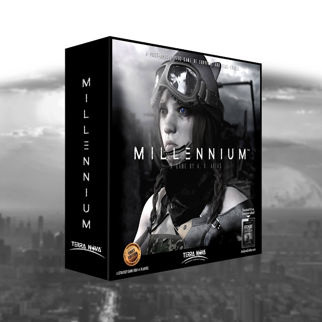
Here's the newly updated box cover I hope to print with the spot-gloss option.
 |
| New Millennium Game Box |
This is a rough version of the new square box.
(large stout box) The main difference is the gradient around the letter M, which will be printed in shiny spot-gloss while the remaining image is a matte black around it.
Here's a sample of spot-gloss on the game board. It gives the spot a glossy and raised texture that's hard to see here but it is a very impressive effect.
I decided to go with a more comic book style to the box and a graphic novel feel for the books with the same idea. More contrasting colors and black and white gradients throughout.
It's not a hard and typical graphic novel look, but it has that flavor. As the design progresses over the next few months, I suspect I might indulge a bit more in the graphic novel approach to all the artwork.
 |
| Spot-Gloss |
Overall, I think it's a bit more eye-catching and trendy, I suppose so this could be the direction I'll go in when I launch the game this September (fingers crossed).
It's a work in progress, as all things are and so I hope to fine-tune everything else to match and optimize the game mechanics, which is very important. I tend to work backward and tackle the design elements first because I work visually towards the end product. So all the moving parts are in place but I need to synchronize all those wonderful parts with an exciting game that players will love.
That's really the hard part. Everything else is window dressing but for me, that's an easier way to develop games. It's a lot like designing the poster for a movie before you write one word of the script. I think it's a good approach in this case too because I work visually, which is a good thing since players are first going to see the box before they learn to play the game.
I don't know about you, but that makes perfect sense to me.
In reality, I work on everything along the way, including writing descriptions of the game and developing images to go along with it for marketing and promotional purposes. And that reminds me of the back or bottom of the box. I won't be printing the bottom now but here's a preview of the "finished" design.
I've enlarged it so you can read the text, see the texture, and get a feel for the game and how it's played. It's an ambitious project with a broad scope so that takes time to develop and refine as I go along. Ideas are simple but their execution can be daunting as you can see. This image has not been updated with the new gradients yet but it's just a snapshot of the actual prototype box.
 |
| Back of Millennium Game Box |
After I'm done with the game I'll post more about how I went about this design and why. There's much more than meets the eye here because there's so much to tell in a very small space. And so that's always a challenge.
There's an entire book worth of information here as far as design and development but that will be for another post and another time.
Right now, I'm stuck in development hell as long as COVID-19 is around. But that makes the game even better because I'm not rushing anything.
Stay tuned for much more to come about the game's progress. It's slowly but surely getting to a better place than when I started so improvements are essential.
Meanwhile, keep on staying alive and well and keep playing this wonderful game we know as, life in the fast lane.


