 |
| New Remnants Box |
Hungry For The New Board Game Box?
Here are the 3 essential ingredients.
Hooks, Hooks, and more Hooks.
If you're a subscriber to this blog, you probably already know about the importance of hooks. And it's worth repeating because, without the proper hooks, your audience will dismiss your game and look for another image or a catchy phrase in another game that piques their interest and excites them.
In other words, your packaging must instantly push all the right buttons for the genre. It's just that simple and that important.
Let's break it down
First things first. Your main image must grab their eye and mind all at once. For Remnants, Andrea's face, her expression, says it all. She's not startled or surprised by what she sees, but something has caught her attention.
Next, you'll notice the big-ass Glock in her bionic hand. After all, she is an Android, with a backstory, mind you. And that says a lot about her already. She knows how to protect herself. So far, so good. And who doesn't carry a weapon these days? Many people do and whether they carry one lawfully or not is another matter. But in the near future, personal protection is a must. And all the doomsday preppers said, AMEN.
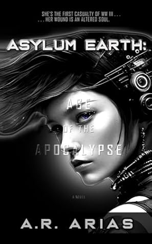
Aside from all that, she's dressed to survive. Not to mention her one blue eye. That detail is mentioned in the first book, Edge of The Apocalypse (featured on the bottom right side of the box).
Other Hooks
 |
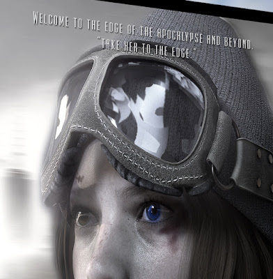
| Tagline Closeup |
Taglines
We all know about hierarchy when it comes to copywriting for advertising or packaging of any kind and as you can see, the 2 lines read:
- Welcome to the edge of the apocalypse and beyond.
- "Take her to the edge."
I hadn't come up with this until now because that's just the way things go sometimes but I think this is good enough to stick with for the next printing.
As a side note, these two lines are at the top of the box (first lines) but they're not what the viewer sees first because the name or title of the game is front and center in a much larger size, as it should be. Nevertheless, the hierarchy still works as-is and potential buyers most likely will read those first two lines after viewing the name, Remnants right in the middle of the box, and the all-important subtitle, Supreme Survivor.
The word Remnants has a built-in curiosity and that's an advantage right there. Then there's the sub-title, which has a good ring to it because it evokes the object of the game in a catchy way. Yes, I could have used lone survivor or last survivor, but the word supreme is fresh and on point for the genre.
What's effective about that first line is that it mentions the title of the first book and evokes the title of the last book. That's clever enough and a great choice of first words.
The second line is of course a double entendre. No explanation is needed but suffice to say, it's a good and effective line for those two reasons. It ties in with the first line and evokes not just a sexual innuendo, but two books in the process.
Copywriters are fond of double, or multiple meanings and I'm no different because you get your money's worth when good copy does the heavy lifting. So remember that when you write your copy next time.
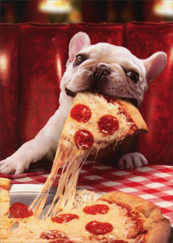
Here's a good example of multiple meanings in the media today:
"Pizza lovers get it."
 |
| Dogs get it too! |
Short and sweet as Marco's Pizza declares in their new ad. But that didn't stop Papa John's from using the same, exact tagline. Who's line is it, anyway? (See what I did there. Right. Let's move along.)
The last line, or bottom line, as it were, evokes the subgenre and the author's name, which right now is not as important because no one has ever heard of A. R. Arias. (Hopefully, that will change next year.)
A Cyberpunk Strategy Game by A. R. Arias
So this line mentions the genre, the game mechanics, and its author. All very important elements that help sell the game in short order.
So there you have it, folks. We've dissected the front of the box and made sense of it all for aspiring copywriters and we've added strong sales copy that should help towards the long and winding road or sales funnel that hones in on prospects of the genre and beyond.
It's a win-win-win for all.
In my next post, I'll cover all the juicy details on the back of the box (so many). Now that's a can of delicious and tempting lines that should make your mouth water for more.
Bon appetite!
All comments or questions are welcome so please post them below.
See you soon. Be safe and play on!


No comments:
Post a Comment