 |
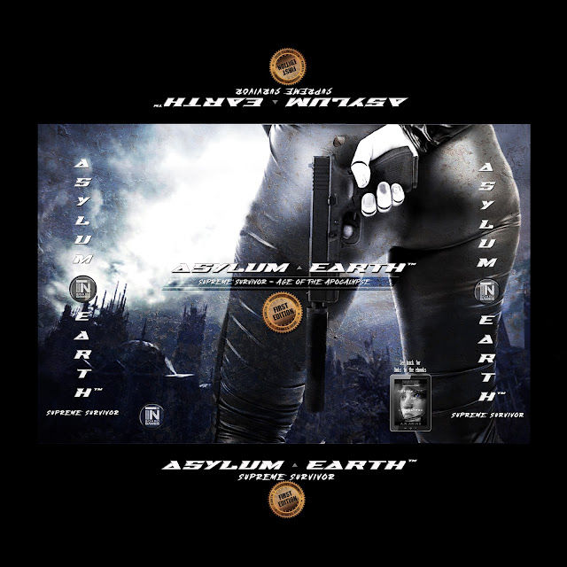
| Asylum Earth Box Prototype Template |
Choosing The Best Image For Your Game
 |
| Pixabay.com |
I'd like the images I'm using more if they were more expressive, for example. As in showing resolve, anger, or determination. Let's face it, the right expression is priceless. But as I like to say, an expressive face paints a thousand words. Good luck finding such an image.
But let's set that aside and discuss the current cover image you see above in the template. A pair of sexy legs in leather pants in lieu of a perfect face. So what's not to like? She's hiding her gun, held by her android hands and a black fingernail. I added those kinds of details to get you thinking beyond the moment. The background, destroyed, also tells a story of its own. In short, everything works to tell a genre story at first sight. You need to communicate that instantly with the right images.
Hail The Genre
The goal is to establish the sci-fi genre and its subgenre, cyberpunk, to arouse curiosity in the viewer and introduce questions in their mind. Where is she? Who is she trying to evade? What happened to her hand? Want answers to these questions? Sure. You know what to do. And that usually means to head to the game website and see what it's all about and eventually, somewhere along the line, place an order.
Wow, now there's a loaded statement, "place an order," so let me count the ways this can go wrong and how you can maximize potential orders. But, that's another topic entirely that I'll cover next time. Right now, we're beginning to see the merits of choosing the proper image(s) to represent your game in the best possible light, for optimum effect and viewer action. Do I mean CTA, or call to action? Uh, sort of. First comes the elusive click you're after. Then a read-through, and finally your CTA. But not yet because we're just getting started with prime images. Sorry, we can't get ahead of ourselves because there's so much to cover.
 |
| Psycho Child? |
Buying Stock Images
You know the drill. You go to your favorite stock photos websites and search for the perfect image and after hours of searching and cursing, you come up empty-handed. That never fails because it's virtually impossible to find the perfect image you really want. So what to do? Open Photoshop, Gimp, or any of your favorite photo manipulation programs and create exactly what you need.
Easier said than done but not impossible so that's how it goes every single time. So the image I finally came up with is a combination of three different stock image website selections and then after applying some creative choices via clone stamping, cut and paste, erasing, and so on and on, and on. Eventually, you get what you want. Not what you need. Something like that. Thank you Rolling Stones.
Okay, you get the picture. My work is almost done here. But after all is said and done, you'll have to test your image to see that it really works as intended. Meaning, that your audience reacts to this image by clicking on it and taking action sooner rather than later.
Marketing and Sales
Again, that's another topic we'll get into some other time. As you can see, one thing leads to another and before you know it, it's a master class in marketing and sales. It's inevitable. Everything in life starts and ends with marketing and sales because everyone has something to sell and fortunately, most people want something to buy. It's the lifeblood of any thriving society. Designing, developing, producing, buying, and selling products of all kinds is what makes life exciting.
But make no mistake. Very few products, if any, sell themselves. And that's where the art of attraction and persuasion, aka, marketing and sales comes in. You must create images that attract attention and tell a story that encourages prospects to search for more information about the product. That should hopefully lead to a sale along the way. You've heard it before, that magical sales funnel. Another can of worms, people. Deal with it.
BTW, one of the TOC titles in my upcoming book reads: How To Trigger Impulse Buying. That's a teaser, if ever.
Subscribe or Miss Out
Or better yet, bookmark this blog, subscribe to it, and don't miss any important articles about designing and developing your game. You won't find this kind of information anywhere else. Search this site and see for yourself.
BTW, I know these posts are short but I'm working on an in-depth marketing and sales ebook (just mentioned) and I'll post a PDF version right here that you can download for free. It's going to cover everything I've discussed here in great detail with a focus on board game design and development.
I'll illustrate six different board game designs I've produced thus far and break down the design and development for each game. It's a free masterclass you don't want to miss. I'm almost halfway done with the book but it's a bit too early to promote it.
Although, I think I'll start to post some of it as I finish each chapter along the way so you can get an idea of its contents.
A lot going on, as usual, so stay in touch and let me know in the comments about any questions or concerns regarding Asylum. What do you think of the new title and cover artwork?
Okay, folks, say it, don't spray it.
See you in the comments.


No comments:
Post a Comment