Friday, June 30, 2017

The Importance of Themes in Board Games

As part of my continuing Blogumentary of the board game, Millennium, I'm now only days away from ordering my first prototype. It's funny how deadlines push you closer to your goals and the design of this box has already gone through about a half dozen different covers in a short six months.

As the game evolves, so does everything else along with it. Hopefully this will be the last design change before the game goes into full production mode in the coming months. It is a long process regardless of how you slice it.

First Prototype Design - Dark with a glimmer of hope.
The first box design was simple and way too dark. The mood I was trying to evoke was darkness and the end of something, End of Days.

As the game evolved I did an about-face and decided to focus on a new day and a bright future as opposed to a dark past and so all the colors and tones had to change accordingly.

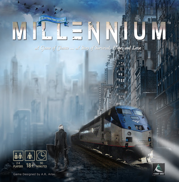
As you can see with the latest design, it feels like something hopeful is on the horizon and that is by far a better outlook for the game.

The game went from a pessimistic POV to an optimistic one and I think that will give it the legs it needs to grow as quickly as possible.

Who can say what will be but I think it's a good bet to focus on the positive as opposed to lingering in darkness. This thought also led me to a stronger hook for the theme of the game and I was able to latch on to the new Millennium, being the year 2000 in this case because placing the game in the year 3000 is quite a stretch.

So in essence, the themes of the game build upon the year 2000 or Y2K as it was known at the time. For those of you who were too young at the turn of the new Millennium, there was some tension about everything digital and how computers, or more accurately, how certain processes governed by computers would adapt to this odd number.

Current Design - A hopeful future is already here.
Luckily, all the points of major crisis were successfully averted and the world went on functioning virtually without a hitch. Without a hitch until the year 2001 of September 11, that is. When 9/11 happened, the world and especially New York City, would never be the same.

It is on these themes of world destruction and world domination by ruthless and evil dictators and megalomaniacs that this board game hinges upon.

"You can't interest people in something they don't
give a damn about."

Quite a heavy topic but a most relevant one indeed. And that's hard to top. Global themes are here to stay for obvious reasons and apparently so are board games. That being said, it's my mission with Millennium to not only bring these themes to light but to shed some light into these dark and foreboding ideas and to provoke positive thought and hopefully positive change.

All that about a board game? Sure, why not? One of the most important checkboxes you need to check when it comes to product design is the product's relevancy and importance to consumers. Things have to matter so that people will care. It's just that simple.

You can't interest people in something they don't give a damn about. It won't work. Everyone is interested in global peace and a positive future so hence this game was born from that idea. Actually it's an old Hollywood trick. You build something around a name or a title not the other way around because certain titles or words have implicit themes built right into them.

It's known as a high concept in Hollywood

In this case I was searching for a word or name with a global theme and Millennium came to me instantly. Once I had the name, everything grew from there.

Certainly I'm not in favor of gratuitous violence in any way as so many video games or board games exploit this to every degree. Any acts of violence in this game are born strictly out of self defense and self preservation, survival.

When the Apocalypse comes in the Biblical sense of the word, it is literally every man, every woman and every child for themselves. Each of us must learn to survive however we can because those who have protected us in the past might not be around for us at the time.

So yes, themes are meaningful to stories and to board games just the same. They must be because without a strong central theme plus minor themes and subplots to support it, the spine of your story or game will not work.

Imagine something without a spine. An animal, a human, a story. Themes must act as strong yet flexible spines where you can attach everything so that it all makes sense.

A strong central theme is the most important structural element for your game.

Don't be caught dead with one.

***********************************************************

BTW, you'll notice a woman in Apocalyptic attire holding an Uzi on the cover and a train in the distance. A no-brainer. Pretty women with guns are a surefire bet.

Also, I forgot to mention that I put together a short teaser for Millennium. It only runs for about 40 seconds and this one comes with quite a kicker or should I say quite a blast at the ending. Still tweaking it but I'll post it soon.

Come on back for that because it's pretty funny.

************************************************************

If you're enjoying this Blogumentary about the making of the board game Millennium, you can subscribe to this Blog or leave a comment below or in the Forum. (See the link above on the right.)

Your comments or questions are always welcome.

Thursday, June 15, 2017

Millennium Board Game Trailer - Filmora, Behind The Scenes


It took me about 2 hours to put this video together (images and clips) and about a week to tweak it. That's the way most videos go. They are a process of elimination, trial and error.

Overall, I'm very happy with the results, although I wish this software wasn't so buggy. It tripped my computer several times and sometimes the timeline wouldn't sync with the music track so I had to close the program and reboot it.

It's not my first experience with Filmora from Wondershare but for the price ($59) I think they have a lot to offer. Previous to this software I had mastered Windows Movie Maker, which is not saying much but I had bought a batch of filters and effects for it and I was happy with the results. For me it was easy to use and I had memorized every shortcut and was able to produce videos in no time.

I still miss some of its features, like panning to any corner you wanted and being able to add up to 7 motion and special effects at the same time. The WMM Greenscreen was a bit glitchy but pretty decent overall. WMM had its good and usable features but lacked the array of filters and overlays that Filmora offers.

While I like to keep things simple,
I'm a sucker for special effects.

While I like to keep things simple, I'm a sucker for special effects whenever a scene calls for it. Like most software packages, Filmora comes with hundreds of effects and many overlays that are mostly suited for advertising or home movies.

What I really like and find useful are the static TV Filters and a good number of Cinematic effects and Lens Flare Filters. In this video I needed to show a series of events in the past and then transition to images of the future to setup the reveal shot for the Millennium logo.

To get those effects I made a short newsreel footage of events using the Static TV Filter (there are 5 different filters to choose from). They worked perfectly for the effect I was after. I could have added some film grain and other similar effects but since this was a flashback reel it wasn't necessary because it went by so fast.

The 7 images are set to .5 seconds each so they go by in a flash but you get the feeling of time lapse and what I'm trying to convey.

Here's a close-up screenshot of the actual Timeline with the images in the video.


The Filmora interface is fairly easy to work with and with limited practice you can put a video together rather quickly without too much effort and get some amazing results.

For me, Filmora's biggest drawback is the lack of panning and zooming filters. Panning is so important because it simulates camera angles and zooming is useful for establishing shots or pulling back to reveal a specific part of an image or scene. Without these effects at the proper speed, your video lacks a cinematic feel.

Am I asking for too much? I doubt it because I can think of dozens of effects I wish I could trade off for the ones I really need that already are included with this software package. I'm sure I can buy the effects I need separately but I haven't looked into that yet.

I had also considered using Sony's Vega Movie Studio 13 but I found it a bit technical for my taste. Otherwise it's a very good choice too.

I just needed to get this video finished so I can move on to other things, which I suppose are equally important. There's just so much to do and only about 18 hours a day to work with.

Let me know what you think of this video and if you have any questions about some of the effects, I'll be happy to Post about it next time.

If you're having trouble putting your videos together I have another blog dedicated to that entirely. You can read all about book trailers and video teasers here:
Book Teasers Pub, Book Trailers and Videos


Welcome Nerds! Do you Know Who This Is?

For those of you old enough to remember The Wonder Years TV Show or if you're into the Retro Channels, can you guess who this is?

It's Paul Pfeiffer! And yes, when I was around 13 I looked just like him. His picture is funnier than mine so I switched it out.

Trust me, we're twins.

Wednesday, June 14, 2017

New FORUM for Board Game Nerd Alert!

I just wanted to share the debut of my brand new Forum for this blog. Funny thing is that I look like the King of Nerds in that photo I just posted. Check out the FORUM link below or on the right and jump right in and start a topic or just say hello.

Board Game Nerd Alert! Forum

I look forward to meeting you and many fellow board game developers and designers. It's going to be a blast!

I've never thought of myself as a nerd or a geek but my photo begs to differ. Who knew? Hey, it's all in good fun. Nerds and board game geeks rule!

Just a little background as a designer, I've been interested in graphic design most of my life and started my own graphics and advertising business back in 1995.

I had just started getting good clients in my home office when my divorce decree came into my life and hit me right between the eyes.

The details are probably typical of all divorces and it turns out my ex-wife and I have been back together for some time now.

Last Christmas my 2 boys got classic board games and we played Clue and Life, and all along I was thinking, "These games are pretty lame and not how I remember them when I was a kid."

So the light bulb went off and here I am a year later, deep into developing three board games. I have to say that I'm having the time of my life. I barely get any sleep and I look forward to working on my games every day, all day long. Yes, retirement does have some privileges.

For me it's not work. It's fun and a heck of a challenge trying to figure out the best game mechanics and graphics for each game. I really think I was born to do this because out of all the many design and copywriting jobs I've had over the years, this is by far my favorite.

I hope you will join me and together we can learn about this unique business and help each other along the way to making the best games in the world.

I'm committed to game development in a way I cannot explain. It's fun and it's addictive just as much as gaming is. And there's nothing else I'd rather do.

Join me today and together let's change Board Gaming for the better!

Play on!

I'm back to my game, Millennium. Working on my last tokens and a few of the cards.

A.R. Arias

BTW, I'm looking to interview on this blog any designer or developer who wants to talk about their games. Email me and let's have some fun with this!

starshipgrafix@outlook.com

Crucial Design Elements for Your Box Cover

When it comes to the front of your game box, there's no question you need to use images that engage your audience instantly.

Your Box-top must not only attract attention, it must tell a story and pique the viewers curiosity.
It's a lot to fit on a small 10 x 10 box. Let's break it down.

Current Millennium Game Box
First things first. When you look at a game box, the first thing it must accomplish is to catch your eye and create some level of excitement.

There are of course dozens of themes and relevant images you can use. Some themes are more popular than others and so on. What you want to say and what an audience wants to hear can be very different things. You must try to keep it fresh and as original as you can.

The point is that you must work on what excites you and hope your audience feels the same way. Because if you can't get excited about your project, I can assure you that no one else will.

I don't go as far as calling myself a Doomsday Prepper, but I am interested and concerned about our future, as many of us are. The End of Days, The Apocalypse, Doomsday, Dystopian Future, whatever you want to call it is not just a trendy topic, it is a reality we face every day. Most, if not all people can relate to it and are aware of its impending arrival.

Whether you believe in the Bible or the Book of Revelation, that's irrelevant. Our future is a global concern to one and all.

That's good news for anyone who is
interested in developing products
related to the future of Earth
because the future is inevitable.

That's good news for anyone who is interested in developing products related to the future of Earth because the future is inevitable. And as I like to think about it. We are living in three realms at the same time because today's present day will be the past tomorrow and beyond. And today is also the future we thought about only months ago. We are in the present time but in reality it is already past and future.

However, it is the future we are most interested in because it is a time we look forward to with the most hope. We cannot change the past, and we can only influence our present time to a degree. The future is something we can plan for and live for today. Without the hope for a better life in the near future, there really is no reason to get up in the morning.

Okay, so much for philosophical views. The point is that as far as games go, themes of the future are here to stay and should do well in the marketplace for a long time to come. That's important because topics come and go and trends can be fleeting. But the future is always in the back of our minds.

That being said, I believe with the proper marketing and promotion, themes about the Apocalypse are safe and sound, so to speak. These are themes that will always be relevant and therefore good for games and other products.

Front of box

The reason I changed my box is obvious. This is a better image than the last one. Simple enough. I always knew I would change it and was using the previous artwork as a placeholder. Although, I couldn't part with that art completely.

In fact I'm still using most of it except that I added another building to the right and Andrea is now standing there in front of the train with an Uzi in her hand. This is a dangerous place for a woman, after all so she's not taking any chances.

Your Box Cover Must Tell a Story

This image tells a better story and it is more eye-catching than the previous image, which was too green, too extreme a cliché and so I toned it down a bit. That building on the right happens to be a real building somewhere in downtown New York City.

It helps to add some authenticity to these images. After all you never know how many architects or city planners are watching. That sounds silly but as a student of architecture, I like to respect the profession for what it's worth.

Thanks to Photoshop's amazing filters and effects, I was able to easily convert this perfectly good building into a dilapidated ruin with just a few clicks. I then added fog and a blue filter to the whole scene just to tie in all the images.

I love the color blue especially here where you want to brighten what appears to be a very dark and ominous scene. If anything, I'm always trying to lighten up or brighten this theme with bright tones and not so many muted grunge effects just for the sake of the genre.

The Main Role of Your Images

There's always so much to consider. So much to weigh and ponder but keep in mind that the images you present on the cover must be an integral part of the story.

It's a lot like a first chapter in a novel. The images and feeling you create at the opening will reflect on the entire book and in this case the entire Millennium project.

The image on the left hidden in all that atmosphere is the original art tweaked for color correction and blurred to create even more distance and a more interesting perspective.

The short of it is this:
I want viewers to be immersed in this world instantly with one look. I want to pique their curiosity and I want them to ask themselves many questions about this opening scene, with just a glimpse of what is to come.

I think I'm on the right track.

Play on!

******************************************************************

My next post is about an important update to the Rule Book and how you can save on its printing cost plus a little trick I used to include collectible artwork that will instantly add value to your game for just pennies.

Stay tuned for that because this tip can literally make or break a game.

Also, I'll soon be posting the new Trailer for Millennium. It's pretty kick-ass and I'll break that down too and point out all the essential elements you must include to make your trailer a huge success.

Your comments and questions are always welcome.


Tuesday, June 13, 2017

Essential Elements When Designing The Back of Your Game Box

The back or bottom of your game box should feature key elements of your game but more importantly it should include a hook that will entice potential customers to buy.


In my case I've included in the Millennium game 4 custom artworks featuring 3 female action heroes from the Playing Cards. Since most gamers are male, you can't go wrong including several "hotties" if for no other reason than just to confirm that guys are pigs.

That's the lead image and lead offer, or the hook that pervs like me, you know, males prefer. It's simply an offer we cannot refuse. Imagine grown men going gaga over manga style artwork. Ridiculous but true.

Okay, enough of that. You get the idea. After all it's not like any women are reading this blog post. But it did cross my mind to include a black female hero for a change. And in fact they all are an important part of the game's ending. Especially Andrea, the half Cyborg, platinum-haired heartthrob.

All these chicks kick ass and look good doing it. What would an Apocalypse be without them?

Okay, back to the box. Here's the back of Ticket To Ride, which happens to be a popular game with global reach. It's a good strategic game and I see the romanticism in it and the nostalgia it evokes. This is the Europe version of the game.


As you can see the back of this box is also very busy with graphics and text. There's just no getting around that. There's so much to say and so little room to fit all of it. Here they've maximize every square millimeter of space.

The back doesn't have to look as pretty as the front of the box but it must pack all the important details about the game or at least a general overview of the story plus plenty of graphics.

The Ticket To Ride box displays the game board and most of its bits and cards. This is something I'm still considering for my box. It's almost a no brainer to include the board but I don't think it's as sexy as female super heroes.

If Millennium gets any traction I'll make room for the board because it is an interesting board. But for now I'm counting on the custom artwork to attract some attention and hopefully work as a flashpoint for sales.

You never know but changes can easily be made with on-demand digital production so it's not a big deal to replace or reconfigure the artwork, which essentially translates into a soft sales pitch.

Always focus on your story and the hero's goal. It's all about that every time. Otherwise you're just playing with little trinkets like clueless children.

That's one reason I like the Apocalypse theme because even children can relate to it without freaking out over it. Let's face it, these days kids grow up hearing and experiencing some of the scariest news we 've ever heard or seen. So for them a game like Millennium is not such a stretch or something out of touch with reality. In fact it's more of a learning experience than anything else.

I know my two boys (11 and 13) get it. They might know more about the End of Days than I do. Which is why they are very important consultants for the game and why Millennium is such an engaging and fun game.

And yes, I've tinkered with the box cover once again. No worries, it only gets better. I'll post the new box cover in a few days. I've been really busy finishing up the board and some playing cards and a bunch of tokens too.

I don't think this work ever ends but I am on schedule to order the prototype in July and improve it from there until November when I go all out with marketing just in time for Christmas.

I also decided to forego Kickstarter. It's just not for me or this project. I'm pretty much developing and funding this project on a shoestring budget with mostly free artwork and while I would like to take Millennium to another level, that will take more time.

Right now I'm just testing the waters by myself to see if the game gets any traction through blogs and limited advertising on social media. If it does, I'll certainly consider tooling up with more customized artwork and game pieces.

As it stands right now, I think that for the retail price of about $39, Millennium is a great deal and a really good quality game at that price-point.

Play on, folks.

Freedom - From the Millennium Board Game. Love the hair and boots!

Andrea from the Millennium Board Game. Meow!
Penelope - Very hot!


Friday, June 9, 2017

MILLENNIUM Game Play Rules


These are only 4 out of 12 pages from the Millennium Game Play Booklet. Most modern board games offer only a sheet or two of white paper for its instructions and game rules. Nothing wrong with that and it's the way I'd like to go but GameCrafter offers their booklets in full glossy color in various sizes. A 12 page 5 x8 booklet runs for about $3.00 each when all is said and done and they have a nice look.

Understandably, GameCrafter.com needs to make a profit one way or another and this seems to be a good way for them to do that. They also have custom wooden dice, which I just saw several days ago. They are very nice and have a big price tag to go with them.

See for yourself on their website. I would like a pair of these dice but starting at $2.95 it's a bit steep right now so I opted for a couple of the 10's dice since my board does have almost the same numbers. They are 59 cents each.


TheGameCrafter.com is quite fair with their pricing despite what some people say. Imagine that you can get a prototype for about $50 on demand as opposed to paying thousands of dollars in tooling costs with a traditional manufacturer and a minimum run of 5000 for example.

We're not exactly picking our poison here. It just depends on how you look at things and when we put things in perspective and weigh all our options. Game Crafter is a great deal.

My prototype is getting there and it's just a matter of time when I can finally order it and see for myself how it all plays out. It seems that just as I claim to be finished with Millennium, I come up with more ways to change it.

No regrets though. I welcome all the changes and the improvements that come with it. The game is getting better all the time. I think I'm finally matching the game mechanics with the theme of the game a bit better and so it makes more sense to add more tokens and take away some of the cards in this case.

I'd been struggling with a that for some time now and I finally decided to not rely so heavily on card mechanics because it just doesn't do my game any good. I think it's far better to use tokens for most moves on the board instead of flipping cards to see where you might land.

Players have more control of their strategy this way and the game seems to have more focus too. So I'll be spending my weekend getting all if not most of that done and seeing how that all works in a mock-up of the game board.

No one ever said this would be easy. And anyone can slap a game together, box it and try to sell it. That might work for a minute until word gets around about how lousy the games plays. All of a sudden that particular game is dead in the water because its game mechanics are weak.

That's a huge waste of everyone's time and money and just what I'm trying to avoid. I'm also trying not to mimic so many of the game mechanics already out there. Truth be told, beyond a handful of classic games, I don't exactly get around too many board games.

While that seems a disadvantage, I think it serves me well because I don't want Millennium to play like any other game. Of course it will inevitably have similar game mechanics to other games but I'm trying to put my own intuitive spin on it. I really don't like many of the modern games today and a lot of it has to do with too many complex rules and weak game mechanics to go with it.

In short, that's a good recipe for disaster.

With Millennium, I'm looking to break the mold of so many bad games out there and put out a game that is inspiring, challenging, and yes, fun to play.

If you're wondering where I can find any fun in a Post Apocalyptic game, have no fear, my life plays out like the Apocalypse every day and I manage to laugh my way through it all.

Don't try this at home. I'm an experienced professional. (This is what I must tell myself.) God only knows what I've gotten myself into.

Hey, my motto in life is simple. If it ain't rocket science, I can figure it out. Stay tuned for an awesome game. I hope to have it on the market by November 2017.

Sure that seems laughable and maybe even impossible, but that's what keeps me going.

Hey, we only live once and we should always strive to do it right the first time around.

And if we fail, that's what second chances are for.

Play on, folks.


Sunday, June 4, 2017

Game Board Nerd Alert!, Nerd Alert!, Nerd Alert!

Okay I couldn't resist so I finally gave in to my temptations and revamped my game box. AGAIN!  If there is anything I know to be certain in graphic design, it's that no design is permanent. Designs evolve over time and making changes is just part of the game.

Besides, I'm really winging it here. I go by the seat of my pants and instinctively make the changes I know will matter most to my overall concept.


In this case, I already had trains as part of Millennium's backstory but I thought trains should be the centerpiece of the game instead and so I added an Amtrak train to the box. It doesn't dominate the design because the concept does not revolve around trains but it is quite prominent.

What does this do to the rest of the game? Don't ask. But of course I had to re-do all my card decks, mats, etc.

Yes, I had to reboot and re-tool my entire design but hey, that's how it goes. No worries, no regrets. Whenever a design can be improved, it should be changed to reflect a better outcome.

At this point I'm considering this design to be "final." Meaning I'll most likely print this on my first prototype to see how it looks live and in living color.

It's hard to tell how graphics will really look on screen regardless of any Mode settings or filters at your disposal. There's nothing like the real thing so I'll give this design a chance to debut and see how it looks and performs.

I also flipped the artwork to match the perspective of the train moving from left to right. Just trying to avoid a Ford Mustang moment if you know what I mean. Plus I added a small banner indicating this design is a collectible first edition.

Not to sound presumptuous or anything. Lord knows I've failed plenty but you have to swing for the fences every time. Nobody cares about your blood, sweat, and tears. They just want to play an interesting and fun game. Period. Nothing else really matters to players at any level.

Bottom of Box
They just want to play an interesting and fun game. Period. Nothing else really matters to players at any level.


But, as you know, the box cover, it's artwork must engage and at the very least should be compelling enough to trigger some kind of curiosity. If it doesn't. It's back to the drawing board.

You can't see all the details from this image but there's a homeless man and his dog in the lower left corner. I think that adds another level to the story and besides, several playing cards feature dogs so I can't go too wrong with that detail.

The biggest challenge in any design is to keep it minimal and clean. That's always hard to do when you want to fit in so many elements. The trick is to pare down and stick to only the most relevant images, maybe a handful of images and then trim from there.

Always easier said than done but I think I'm pretty close to a comprehensive design concept for the Millennium box. I'm not so sure about the background cityscape. I do like it but I know I'll eventually try something else. Maybe something simpler. I also removed a grunge filter, which added some nice sepia tones. As much as I liked that filter, I wanted a cleaner look and feel so I got rid of it.


These are the hard choices you have to make.

These are the hard choices you have to make. I eliminated that filter because of printing concerns. Once I see the actual printed box I might add that filter back into the mix but for now I think it's a bit too much for the overall design. Less is more in this case.

The bottom of the box is another story altogether. Since Millennium is a relatively unknown game, the main objective is to play up the game concept and above all put a positive spin on the game's outcome.

Players don't like going out in a blaze of glory. They want to win and feel a sense of accomplishment and satisfaction by the end of the game. In essence they want to be hero's through the main character. At the very least, players want to feel like they are a part of the game and that they've made the right choices that have played out to a desired outcome.

So the back (bottom) of your box should entice or tease players with some eye candy. Trinkets, cars, chits. Showcase whatever you have as part of the playing experience. Make sure to list the contents of your game and all the legal disclaimers.

While the front of your box highlights the main concept and story of your game,  the back focuses on benefits of playing the game and the game's unique pieces. Designers tend to pack the bottom of the box with way too much information and graphics, but this is acceptable. Again, stick to the basics and try not to crowd or overwhelm your design.

I hope to run another art test this week and most likely will order my first prototype after the test results. I already know which areas of the design need attention and tweaking but until I actually play a live game it's hard to get a feel for the pacing and functionality of the game.

Plenty of details still up in the air. Lots to do so I'll get to it.

Play on!