Book Giveaway - Asylum Earth: Age of the Apocalypse

Goodreads Book Giveaway

Asylum Earth by A. R. Arias

Asylum Earth

by A. R. Arias

Giveaway ends May 17, 2026.

See the giveaway details at Goodreads.

Enter Giveaway
Showing posts with label photoshop. Show all posts

Sunday, April 21, 2024

Asylum Earth Update - A Post-Apocalyptic Board Game

Hey folks, Asylum Earth is still in the works and in the running for one of the most popular games in board game history. It is going to be when the time is right. Within 5 years or sooner, post-apocalyptic games will rule the world. Pun intended.  

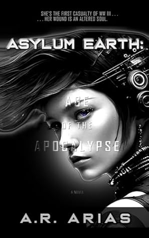
As it stands, the design of Asylum Earth's game box continues evolving as you can see above. As much as I liked Andrea's rear-end shot and her robotic hand holding a gun, I recently got lucky and finally found an image, a face I'm excited about because as I've said before, the right expression hooks players into the game. An intriguing facial expression is always your best option. 

New Asylum Game Box

I found this image on Etsy, of all places, and I'm happy with it. So now I have my new Andrea and I'm working on replacing all the old images throughout the game. Yes, she's worth the trouble because the box cover design must do a lot of heavy lifting to intrigue potential buyers.  
Original Etsy Image
The box cover must tell a story. The original image had several drawbacks so with some Photoshop magic, now her expression comes to life. In short, Andrea is now the unequivocal star of Asylum Earth. Front and center with plenty to say and show her audience.

As you can see, the original image on the right has full-color saturation so I muted the colors to give it a more austere feel. I also raised her left eyebrow to give her a more determined look. I removed the blue streak of hair that appeared to be coming out of her nose. 

Lastly, I gave Andrea her closeup shot and she's ready for prime time with her one blue eye. (See the accompanying novel on Amazon, Edge of the Apocalypse. link) for the interesting story around this detail. 

Here's an interesting tidbit about the design and development of a product. From the beginning, I've been looking for the image you see on the box above. I searched high and low at all the best art venues and clip art sites galore and I did find good art but it was right for this box only when I stumbled on the right face on Etsy. Imagine that. It's been about 3 years since I've tried many different ideas and images that didn't work for me.

Digital Novel
The amazing thing is that once you find the right image, everything opens up and flows how it's meant to and you finally become unstuck and head towards the finish line. That's still at a distance but within reach so as time ticks on, I will cross that finish line but I'll also be faced with another goal called marketing. 

I know a thing or two about that so stay tuned for a crash course about marketing an unknown product from scratch. You'll be surprised at some obstacles to overcome and how to approach your marketing and jumpstart your sales.

Come on back for more of that. Meanwhile. if you like what you see, drop me a comment if you can.


Thursday, January 3, 2019

Game Crafter's New Retail Box

New 9x12 Retail Box
Happy New Year, people! We've made it to another amazing year and I'm wishing you a prosperous new year and an exciting and inspiring time reaching your dreams.

For me, there's no better way to start the new year than with new and fresh business plans and ideas. If you're not growing and learning new and exciting things every day, life becomes a monotonous series of daily events. And so with that frame of mind, I'm committed to venture into unknown territory with no fear, no apprehension, and certainly high expectations as I hope you are too.

Pursue what's possible and everything will fall into place. Trust what you know and follow your passion to wherever it takes you and beyond. You'll be surprised how far you can get on a whim.

So along with the new year, comes a new box for the Millennium board game. Yes, this game is alive and well and just about to hit the shelves this coming September 11, 2019, with its companion book, The Edge of The Apocalypse.

The book (available in three formats) will be published sooner but the official launch for both products is 9.11.2019.

New Book Cover
In case you missed it, here's the new cover for the book. As you can see, I've added a pier and Andrea's dog, Apollo. I resolved the problem with the missing feet and so the book should trim close to how this one looks. I think I'll keep these colors and not try to match the book cover to the board game cover.

Here's a link to the previous article about the (details) new cover design.
https://boardgame-news.blogspot.com/2018/12/awesome-book-cover-design-tips.html

Although, the more I think about it, the more I'm inclined to tone down the colors on the book cover to almost black and gray, mostly because when you pair these products in one shot they should match in some way. I don't think that will make or break the presentation either way but I'll juxtapose a gray version of the book cover to see how they look together.


There are subtle differences to the game box too. I switched out the main font for the Millennium name because the Montalban font is more distinctive and looks more futuristic. I also toned down the grunge filter so the name stands out a bit more.

About The New Box 

The big difference with this new box is the style of the box itself. This is Game Crafter's 9x12 Large Retail Box. At first glance it's a bit unusual because the sides (from the top of the cover) don't reach the bottom of the box. The top and bottom of the box halves (each 1" deep) meet half way to the middle and that's why it looks split. See the Game Crafter video to see how they explain the reason for this kind of box. They claim it's stronger and more durable when folded this way.


I'm sure it is a sturdier box but I'm not so sure it's a great idea for the sides because it limits the width (2 inches) of the space for images, but I do think it looks different and eye-catching enough that buyers might be inclined to pick up the box off a shelf just out of curiosity.

One can also try to match the bottom of the box to the top of the box to create a seamless image on the 2 inch sides but I doubt these images will match up because the first prototype box top was off by almost half an inch! I'm not sure what happened with their registration marks but the cover was way off, with the name too close to the edge on the top of the box. I'll be sure to comment about that when they print this next 9x12 prototype. Either that or I'll be more careful to position the cover image exactly how I want it t appear.

We are all born with great intuition and natural instincts. 
These qualities are all we need to survive in life.
Thriving is just a matter of details.

I never fussed about it because these are only prototypes, but I hope this next box looks a lot better than the first. Another concern was how dark most of the images printed. I've made adjustments to the artwork by increasing the brightness about 20% on Photoshop so when the PNG files upload and you enable the color filter, the artwork will not appear or print as dark as it did before. This box is also big enough to fit the 6-fold game board that I'm using so I can fit the entire U. S. map as opposed to just the east coast as in the first game.


Millennium has evolved in so many ways and my advice to game designers is to start with a solid core concept and develop the game from that concept outward until you reach a conclusion that satisfies the players.


You must have a clear event or incident that sets the game off and leads to both short-term and long-term goals leading up to the game's conclusion and the big finale; the ultimate strategy and final goal that makes the game worth playing from start to finish.

Millennium's Concept


In Millennium's case, a nuclear explosion in Austin, Texas, sets the game off in a big way and triggers apocalyptic events revealing the attacker's Manifesto with their warnings and taunting demands. As explosions randomly ripple across the land, you solve clues and anagrams to stay clear and avoid the next bomb.


You can also rescue survivors for extra points as you try to avoid a variety of obstacles and pitfalls along the way. You can find different modes of transportation, such as electric cars, scooters, and even an Amtrak train.

If you reach Brooklyn, NY, you can travel back in time via a time portal at the Meridian line via Coney Island's Astroland Amusement Park. Each of these events and cities have card decks to help you get there and accumulate points as you go.


In short, it's an interesting and fun American history lesson as you make your way across the map to your nearest safe haven.

There's much more to the game, including video links, a Rule eBooklet with all the game rules and game play you need to know, right on your phone or tablet. They are minimal because the game is designed intuitively since events happen sequentially as they might in real life.

As the day of publication nears, I'll post more details about how to play the game. The rule book is only about 15 pages long and the game is very easy to learn. In addition, all card decks provide plenty of information on your next move so it's a quick game to learn as you play.

You can access the (unfinished) eRule Booklet here:
https://boardgame-news.blogspot.com/p/millennium-rules.html

Join the fun on Twitter

Wednesday, June 14, 2017

Crucial Design Elements for Your Box Cover

When it comes to the front of your game box, there's no question you need to use images that engage your audience instantly.

Your Box-top must not only attract attention, it must tell a story and pique the viewers curiosity.
It's a lot to fit on a small 10 x 10 box. Let's break it down.

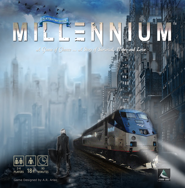
Current Millennium Game Box
First things first. When you look at a game box, the first thing it must accomplish is to catch your eye and create some level of excitement.

There are of course dozens of themes and relevant images you can use. Some themes are more popular than others and so on. What you want to say and what an audience wants to hear can be very different things. You must try to keep it fresh and as original as you can.

The point is that you must work on what excites you and hope your audience feels the same way. Because if you can't get excited about your project, I can assure you that no one else will.

I don't go as far as calling myself a Doomsday Prepper, but I am interested and concerned about our future, as many of us are. The End of Days, The Apocalypse, Doomsday, Dystopian Future, whatever you want to call it is not just a trendy topic, it is a reality we face every day. Most, if not all people can relate to it and are aware of its impending arrival.

Whether you believe in the Bible or the Book of Revelation, that's irrelevant. Our future is a global concern to one and all.

That's good news for anyone who is
interested in developing products
related to the future of Earth
because the future is inevitable.

That's good news for anyone who is interested in developing products related to the future of Earth because the future is inevitable. And as I like to think about it. We are living in three realms at the same time because today's present day will be the past tomorrow and beyond. And today is also the future we thought about only months ago. We are in the present time but in reality it is already past and future.

However, it is the future we are most interested in because it is a time we look forward to with the most hope. We cannot change the past, and we can only influence our present time to a degree. The future is something we can plan for and live for today. Without the hope for a better life in the near future, there really is no reason to get up in the morning.

Okay, so much for philosophical views. The point is that as far as games go, themes of the future are here to stay and should do well in the marketplace for a long time to come. That's important because topics come and go and trends can be fleeting. But the future is always in the back of our minds.

That being said, I believe with the proper marketing and promotion, themes about the Apocalypse are safe and sound, so to speak. These are themes that will always be relevant and therefore good for games and other products.
Front of box

The reason I changed my box is obvious. This is a better image than the last one. Simple enough. I always knew I would change it and was using the previous artwork as a placeholder. Although, I couldn't part with that art completely.

In fact I'm still using most of it except that I added another building to the right and Andrea is now standing there in front of the train with an Uzi in her hand. This is a dangerous place for a woman, after all so she's not taking any chances.

Your Box Cover Must Tell a Story

This image tells a better story and it is more eye-catching than the previous image, which was too green, too extreme a cliché and so I toned it down a bit. That building on the right happens to be a real building somewhere in downtown New York City.

It helps to add some authenticity to these images. After all you never know how many architects or city planners are watching. That sounds silly but as a student of architecture, I like to respect the profession for what it's worth.

Thanks to Photoshop's amazing filters and effects, I was able to easily convert this perfectly good building into a dilapidated ruin with just a few clicks. I then added fog and a blue filter to the whole scene just to tie in all the images.

I love the color blue especially here where you want to brighten what appears to be a very dark and ominous scene. If anything, I'm always trying to lighten up or brighten this theme with bright tones and not so many muted grunge effects just for the sake of the genre.

The Main Role of Your Images

There's always so much to consider. So much to weigh and ponder but keep in mind that the images you present on the cover must be an integral part of the story.

It's a lot like a first chapter in a novel. The images and feeling you create at the opening will reflect on the entire book and in this case the entire Millennium project.

The image on the left hidden in all that atmosphere is the original art tweaked for color correction and blurred to create even more distance and a more interesting perspective.

The short of it is this:
I want viewers to be immersed in this world instantly with one look. I want to pique their curiosity and I want them to ask themselves many questions about this opening scene, with just a glimpse of what is to come.

I think I'm on the right track.

Play on!

******************************************************************

My next post is about an important update to the Rule Book and how you can save on its printing cost plus a little trick I used to include collectible artwork that will instantly add value to your game for just pennies.

Stay tuned for that because this tip can literally make or break a game.

Also, I'll soon be posting the new Trailer for Millennium. It's pretty kick-ass and I'll break that down too and point out all the essential elements you must include to make your trailer a huge success.

Your comments and questions are always welcome.