When it comes to the front of your game box, there's no question you need to use images that engage your audience instantly.
Your Box-top must not only attract attention, it must tell a story and pique the viewers curiosity.
It's a lot to fit on a small 10 x 10 box. Let's break it down.
 |
| Current Millennium Game Box |
First things first. When you look at a game box, the first thing it must accomplish is to catch your eye and create some level of excitement.
There are of course dozens of themes and relevant images you can use. Some themes are more popular than others and so on. What you want to say and what an audience wants to hear can be very different things. You must try to keep it fresh and as original as you can.
The point is that you must work on what excites you and hope your audience feels the same way. Because if you can't get excited about your project, I can assure you that no one else will.
I don't go as far as calling myself a Doomsday Prepper, but I am interested and concerned about our future, as many of us are.
The End of Days, The Apocalypse, Doomsday, Dystopian Future, whatever you want to call it is not just a trendy topic, it is a reality we face every day. Most, if not all people can relate to it and are aware of its impending arrival.
Whether you believe in the Bible or the
Book of Revelation, that's irrelevant. Our future is a global concern to one and all.
That's good news for anyone who is
interested in developing products
related to the future of Earth
because the future is inevitable.
That's good news for anyone who is interested in developing products related to the future of Earth because the future is inevitable. And as I like to think about it. We are living in three realms at the same time because today's present day will be the past tomorrow and beyond. And today is also the future we thought about only months ago. We are in the present time but in reality it is already past and future.
However, it is the future we are most interested in because it is a time we look forward to with the most hope. We cannot change the past, and we can only influence our present time to a degree. The future is something we can plan for and live for today. Without the hope for a better life in the near future, there really is no reason to get up in the morning.
Okay, so much for philosophical views. The point is that as far as games go, themes of the future are here to stay and should do well in the marketplace for a long time to come. That's important because topics come and go and trends can be fleeting. But the future is always in the back of our minds.
That being said, I believe with the proper marketing and promotion, themes about the Apocalypse are safe and sound, so to speak. These are themes that will always be relevant and therefore good for games and other products.
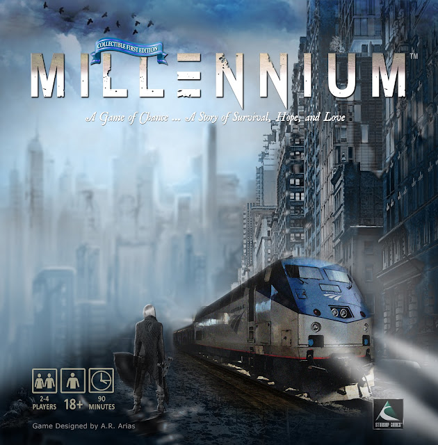 |
| Front of box |
The reason I changed my box is obvious. This is a better image than the last one. Simple enough. I always knew I would change it and was using the previous artwork as a placeholder. Although, I couldn't part with that art completely.
In fact I'm still using most of it except that I added another building to the right and Andrea is now standing there in front of the train with an Uzi in her hand. This is a dangerous place for a woman, after all so she's not taking any chances.
Your Box Cover Must Tell a Story
This image tells a better story and it is more eye-catching than the previous image, which was too green, too extreme a cliché and so I toned it down a bit. That building on the right happens to be a real building somewhere in downtown New York City.
It helps to add some authenticity to these images. After all you never know how many architects or city planners are watching. That sounds silly but as a student of architecture, I like to respect the profession for what it's worth.
Thanks to Photoshop's amazing filters and effects, I was able to easily convert this perfectly good building into a dilapidated ruin with just a few clicks. I then added fog and a blue filter to the whole scene just to tie in all the images.
I love the color blue especially here where you want to brighten what appears to be a very dark and ominous scene. If anything, I'm always trying to lighten up or brighten this theme with bright tones and not so many muted grunge effects just for the sake of the genre.
The Main Role of Your Images
There's always so much to consider. So much to weigh and ponder but keep in mind that the images you present on the cover must be an integral part of the story.
It's a lot like a first chapter in a novel. The images and feeling you create at the opening will reflect on the entire book and in this case the entire Millennium project.
The image on the left hidden in all that atmosphere is the original art tweaked for color correction and blurred to create even more distance and a more interesting perspective.
The short of it is this:
I want viewers to be immersed in this world instantly with one look. I want to pique their curiosity and I want them to ask themselves many questions about this opening scene, with just a glimpse of what is to come.
I think I'm on the right track.
Play on!
******************************************************************
My next post is about an important update to the Rule Book and how you can save on its printing cost plus a little trick I used to include collectible artwork that will instantly add value to your game for just pennies.
Stay tuned for that because this tip can literally make or break a game.
Also, I'll soon be posting the new Trailer for Millennium. It's pretty kick-ass and I'll break that down too and point out all the essential elements you must include to make your trailer a huge success.
Your comments and questions are always welcome.


